Here are some basic tips to improve typography in design I've learned over the last 10 years. Helpful for all areas and types of design.
Let’s admit it. Creating color palettes in Product Design is a tough feat to do well, and there doesn’t seem to be much of a process besides trial and error usually for figuring out what will work best in context.
While this is true, there is an approach you can take that will put you on the right path with opacities, similarly to my post last week on Text Colors in Product Design. Let me explain!
Primary Brand Color
If you work at a company, chances are that your primary brand color is settled upon at this moment. The basis of this process relies on your brand primary color as that will be what users will most likely see throughout the application. Using your brand color as a starting point will keep this process and color palette harmonious and consistent. For simplicity’s sake, I’m going to start with this purple as the primary brand color in my example.
Brand Black
Now, using my primary brand color, I’m going to create a black that is on brand with my primary color. I recommend not using a pure black color in the product you are working on (unless you’re brand color is pure black, then that works ¯\_(ツ)_/¯) as it can feel stark and inconsistent with other colors you are using.
It’s simple to do this, just start with your brand color (our purple in this case) and bring your slider straight down (or even down and a little to the right for saturation) until you reach a comfortable “black” that contains hue from your primary brand color without getting to the bottom. See below!
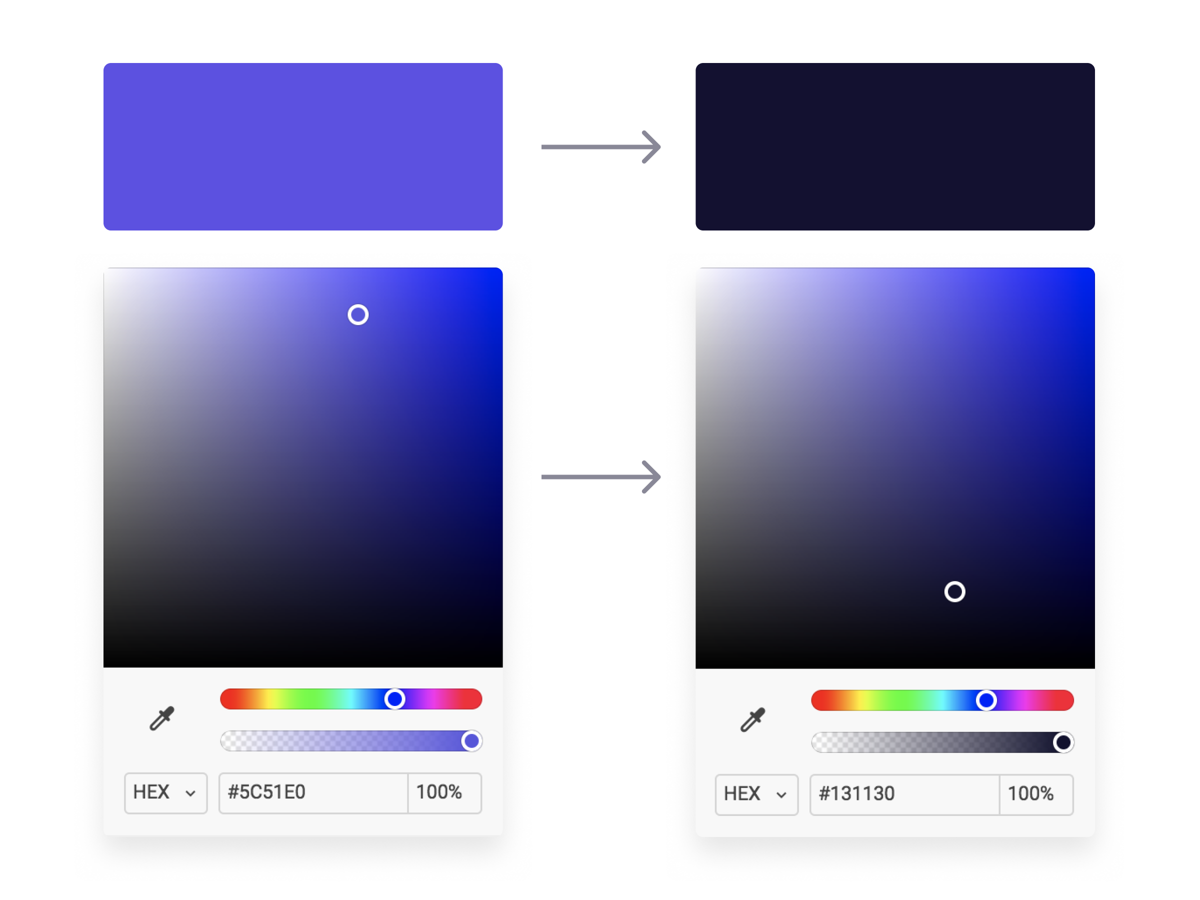
Now we have a “black” that is dark enough to use how we would normally use a black (text, background, etc.) but it won’t feel stark or contrasted when paired with our primary brand color. The cool hue provides familiarity to our “black” and serves as a basis for building out the rest of our color palette. Speaking of, let’s move on to opacities!
Opacity Galore
With our Brand Black created, we can now easily generate a color system to be used on elements and backgrounds throughout our product using opacities. I took our Brand Black and made 5 other copies, lowering the opacities by 20% until the last one where I go to 5% for light backgrounds keeping the background as a solid #FFFFFF white. Then, I do the same with a dark background using a pure #FFFFFF as the basis and lower the opacities the same way I did for the Brand Black. See below!
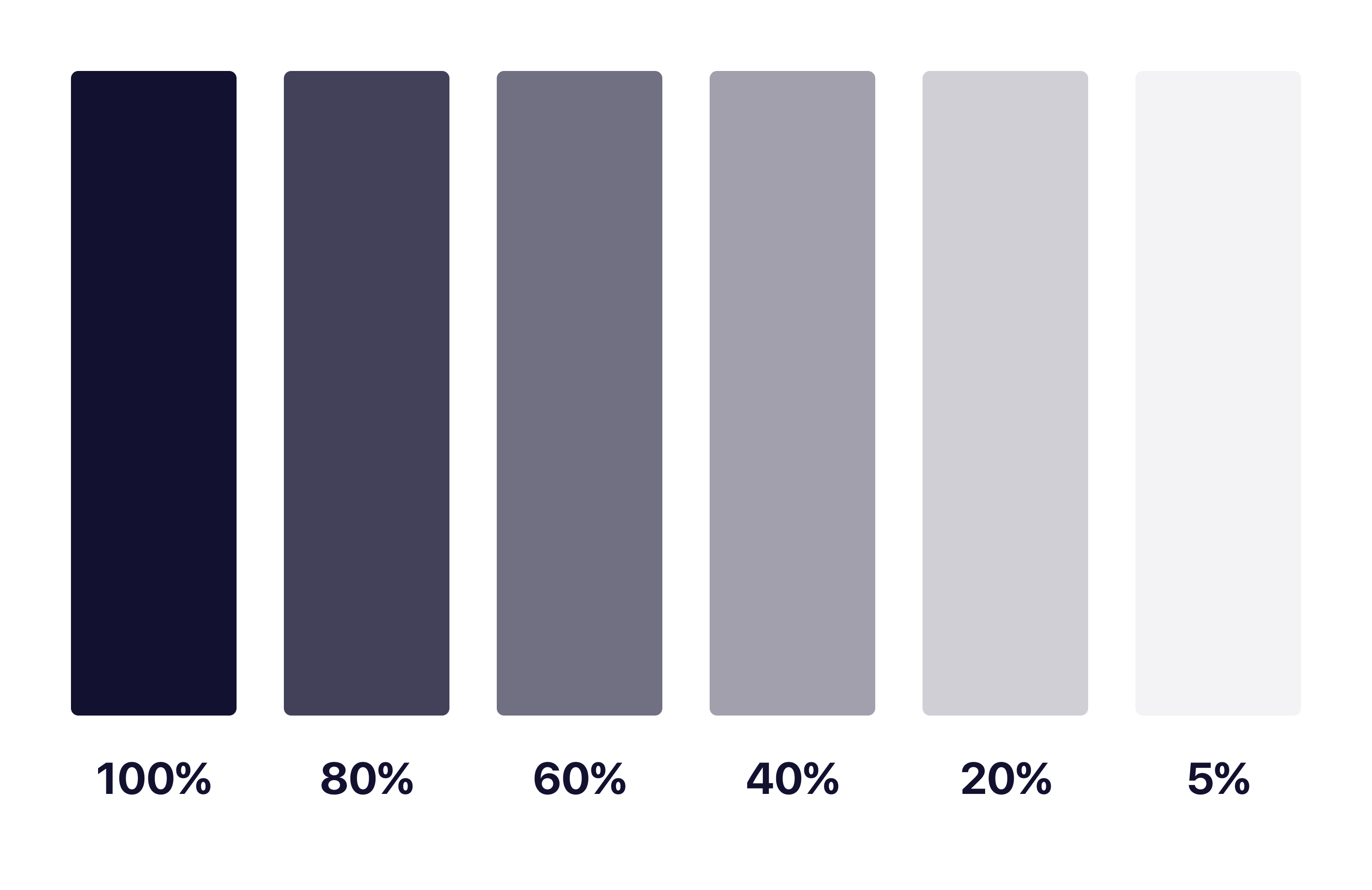
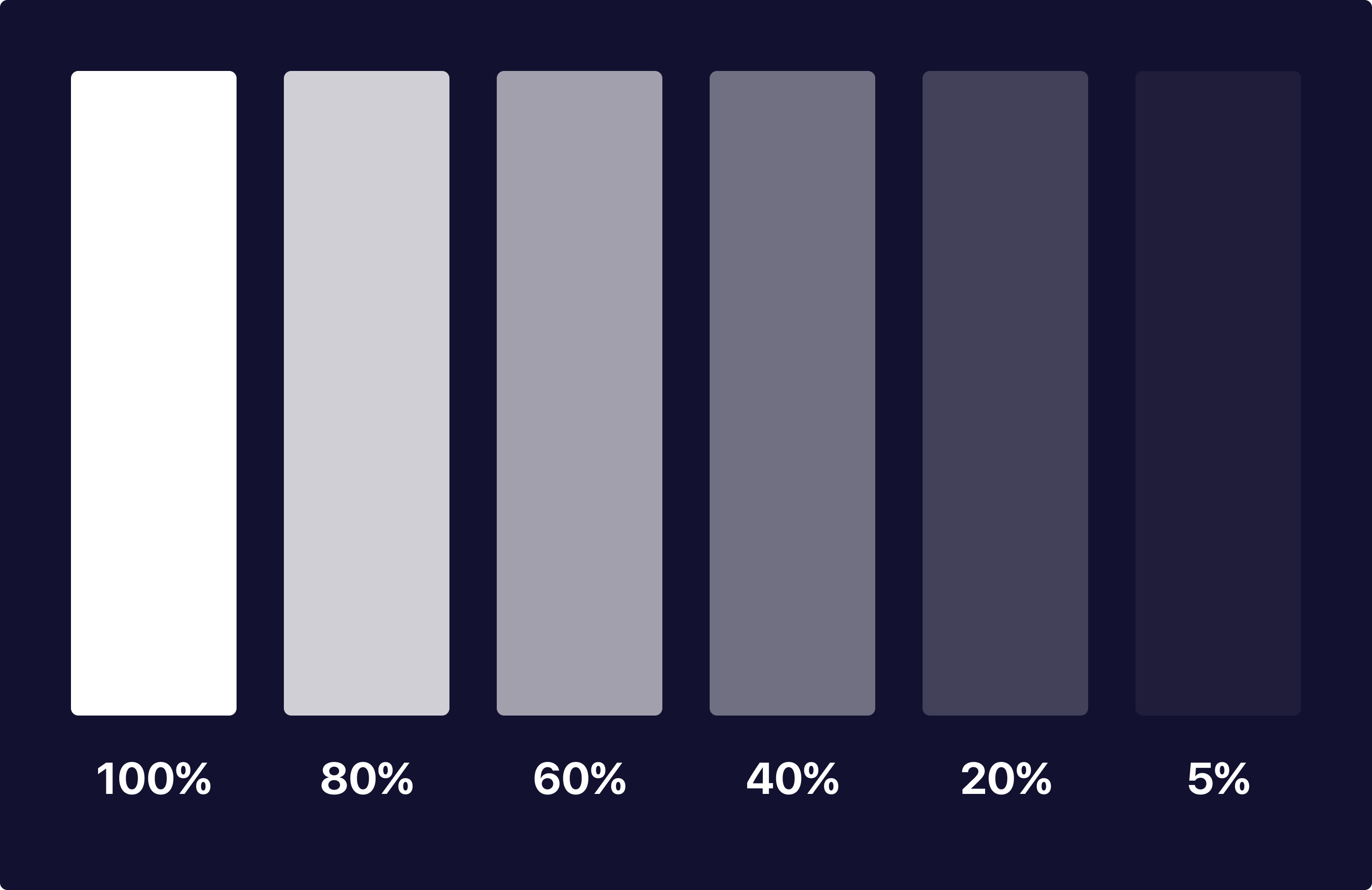
As you can see, each of these colors have the same base hue and keeps them looking and feeling consistent as a palette throughout your application. No more having to guess what colors and hues will match with endless trial and error testing!
With matching hues, these neutral tones will serve as a basis for colors of different neutral elements. I tend to make a key for what each one of these will represent, and using them together makes for interesting combinations of elements that you can use to your advantage in different scenarios.
In Product Design Practice
Here’s a quick concept example I made using the brand color and opacities I mentioned above:
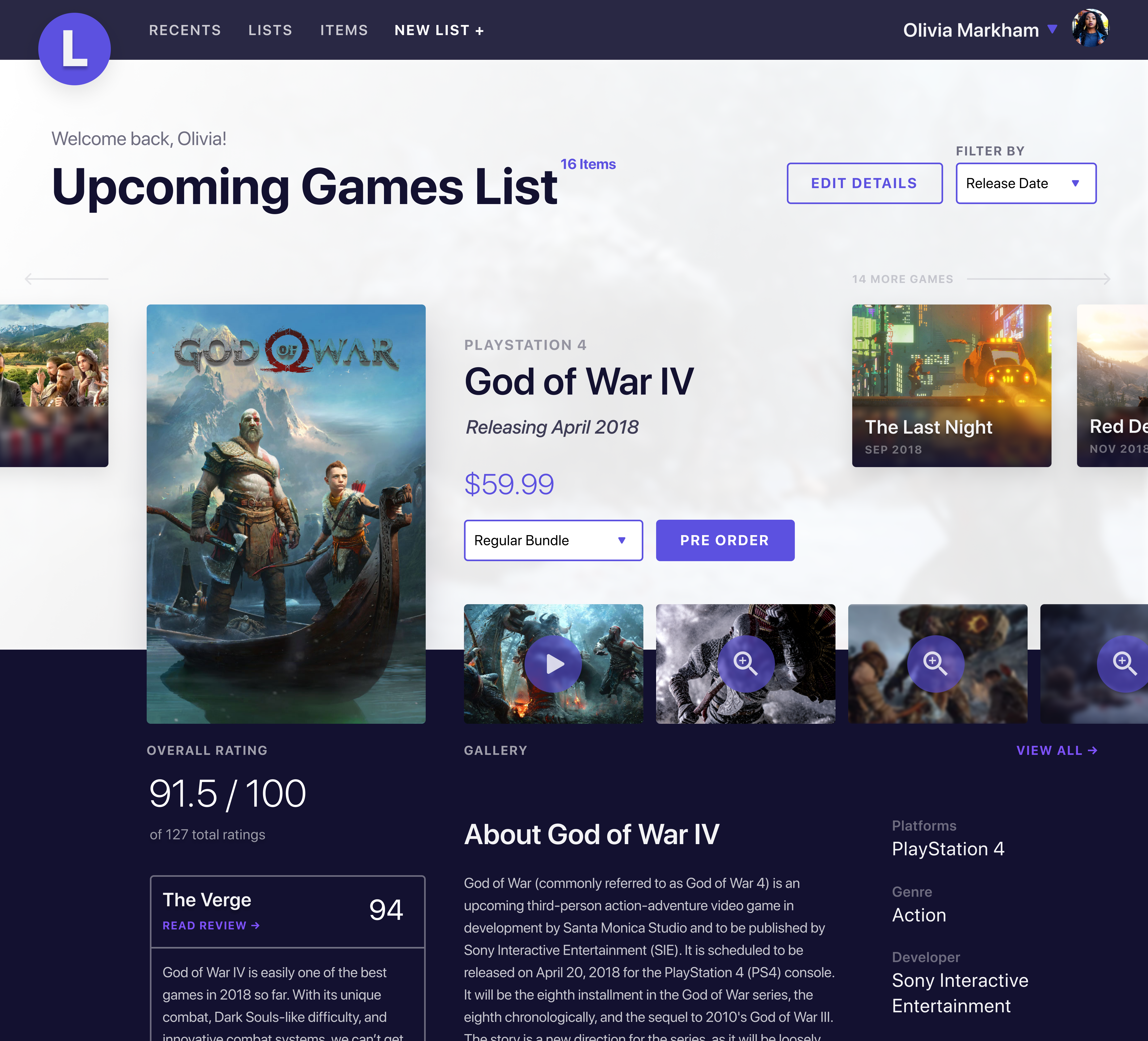
As you can see, each of the colors have a mixed hue of our primary brand purple color while keeping the overall feel and accessibility consistent for users. None of the colors feel stark or out of place and we have the ability to use our brand color as actions with neutral elements not feeling out of place or distracting.
What About Passing to Developers?
Okay so now you may be asking yourself how you can communicate this system with a developer and how it would work in code. It’s actually quite simple! Luckily for you, both mobile (yes, native too) and web technologies support an RGBA function as a way to specify color values. How does this work? Here’s a little key and example:
rgba(230,18,75,0.5);

// the first 3 numbers are your R, G, and B values (0 - 256).
// the last digit is the alpha, or opacity in our case
  // pass in a decimal number equal to the opacity you want


// EXAMPLES

// For a black at 5% opacity
color: rgba(0,0,0,0.05);

// For a white at 80% opacity
color: rgba(256,256,256,0.8);
And voilà! You can create a key very simply for developers like you normally would with a style sheet of some sort, just exchange hex codes for RGBA function values for your neutral colors. I’d also recommend creating a guide around when and where to use certain opacities as a guide for your design team and development team to keep this usage consistent for user patterns.
Hope you found this useful and insightful!

Even as an Apple fanboy that loves MacOS and iOS, I know that like any software, it isn’t perfect. Not to mention the lack of customization options and (at times) a cluttered interface.
Over time, I’ve found a few apps that replace default Mac apps that make MacOS a better operating system to use. I happily pay and advertise how useful they are just because of the sheer influence and impact they’ve had on my digital workspace and workflow.
In this article I’ll happily share them with you and (hopefully) dodge the dozens of questions I get every time I post a screenshot of something and happen to include one of those apps. Kidding! But no seriously, I need a place to direct people that ask this over and over ?
Bartender
https://www.macbartender.com - $15
I’m the type of person that likes to have the least amount of visual clutter and items in my view when I’m working. I tend to get easily distracted by icons and notifications and have geared my digital workspace to avoid that.
Bartender has been one of the best apps for this quirk that I have as it takes those 10–20 icons that show in your top bar and hides them in a secondary bar you can toggle on/off easily. No more having to get distracted by random red notifications and status updates!
Alfred
https://www.alfredapp.com - free or $19 for full
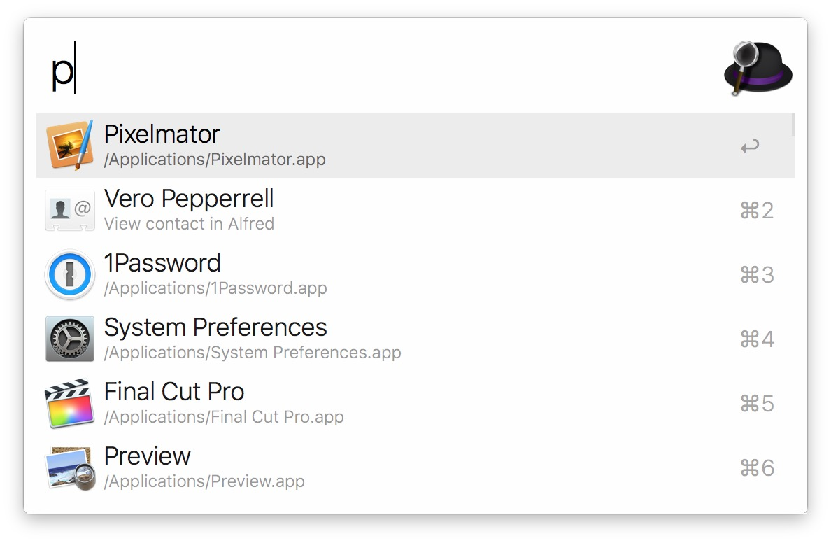
To be honest, I’m still baffled that Apple’s Spotlight feature is as poorly made as it is. It has become quite unpredictable, doesn’t accept keywords to better filter what a user wants, searches unusable files, mixes files with apps in search, etc.
This is where Alfred comes in. Alfred is basically a customizable version of what Spotlight should be. Not only can you customize the look of Alfred, you can also add and create “workflows” to make your own shortcuts that make your life easier. Alfred also uses certain keywords to better understand what you’re looking for and what actions you are trying to take. For example, if you just type a name it will search for apps, but if you type “open” then the file name, Alfred will switch from looking at your apps to looking at files you can open.
uBar
https://brawersoftware.com/products/ubar - $30
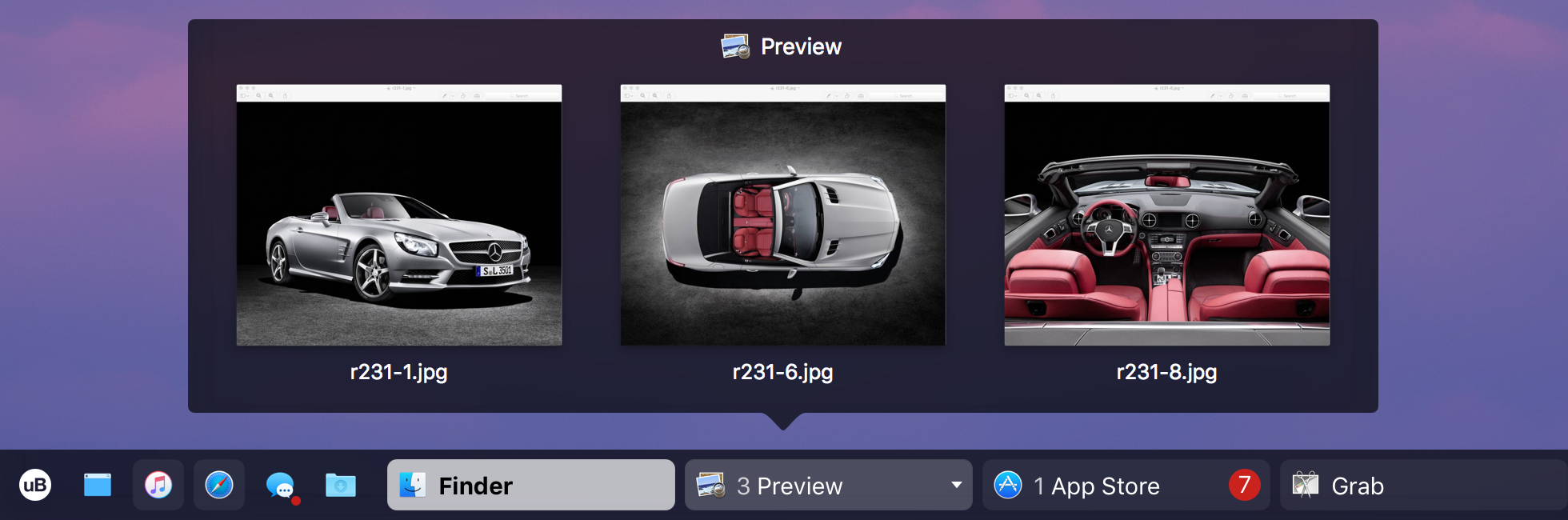
I get asked about this app the most and I can understand why if I’m being honest. While MacOS default dock gets the job done, it doesn’t try and do much more outside of that (possibly for better battery management). uBar takes your dock up a notch while also making it quite nicer to use, while customizable and nicer to look at.
uBar creates a smaller dock that can hold favorite apps you have, provide better context on notifications, generates window previews on hover, lets you choose which window to open to, lets you see a calendar on hover, and gives shortcut access to your main Finder folders and preferences just to name a few. I personally like that it feels more out of the way than the original dock and still feels in place in adjacency to the top bar. You can even change where it is positioned and the style of dock you’d like.
CloudApp
https://www.getcloudapp.com - free or $8 for Pro

Just like Alfred, CloudApp makes the original MacOS screenshots ten times better. With CloudApp you can use a keyboard shortcut to take a screenshot (or record a gif!) and instantly get a link that you can share with others.
This app has been super helpful for me in my work life for sharing screenshots of design and code items I’m working on for instant feedback and no hassle of uploading. CloudApp is super fast and makes recording gifs when showing animations or click throughs very easy as well.
VEEER
https://veeer.io - free
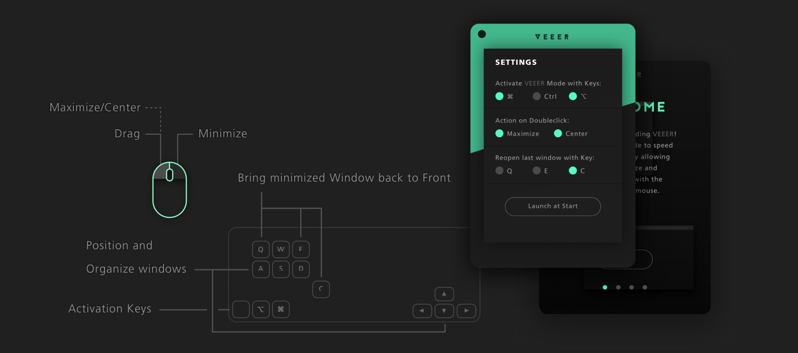
While there are quite a few window managers out there for Mac, I personally use VEEER because of how lightweight it is. It does what I need it to without using up RAM and slowing down what I’m working on. It also has a few small unique shortcuts like the way it alternates full screen and minimized windows.
Hope you found this valuable and I hope you try out the apps I mentioned. Got other apps that make MacOS better? Let me know which others I need to try out!

As of when I am writing this, I am starting my first day at my new job tomorrow. I’ll be starting as a Product Designer at Dave, a financial tech company based in Los Angeles.
While looking for the next place to call home for my work life, culture was one of the biggest deciding factors for me. I believe that working with folks you can also call your friends outside of a work setting makes for the best outcome and work ethic at a company.
However, outside of culture, I was also looking for a role that was slightly out of my grasp and knowledge of prior experience. I was looking for something unfamiliar and that I hadn’t yet mastered. I’ve learned over my time in the industry that the best way to stay happy and challenged at a job is to work on things you haven’t had the exact experience with. It keeps you on your toes, keeps you learning, and keeps you yearning to get even better at what you do. You quickly realize you aren’t a master at your field, yet you can be a master at managing and improving how you approach each of these unique experiences.
Dave for me was a great step in the right direction for my career. At Dave I’ll be working on designing the future of finance as someone who has never designed specifically for this field, and for a change my job won’t only rely on what is looked at on screens. I’ll be working on designing real life experiences from brand to packaging and more. On top of that, I’m the first designer to be full-time at the company besides the CPO. As a result I’ll be working on developing a process around how design works with other parts of the company and probably even hiring and leading other designers as we begin to grow the team.
How this applies to your career and how you work can go many different ways, but I think the overall guidance of looking for something you feel confident yet unfamiliar with is a good place to start. The exciting part of life are the times we apply ourselves to overcome new obstacles, leading to a better you. Having the foundational skills for the job to rely on while using the rest of your skillset to learn and adapt I have found to be the best teacher in life, no matter how many mentors I have or books I read.

Working remotely is all the rage nowadays. Companies can hire more diverse sets of people, save money on salaries, and find the best people fit for the job. After all, 43%of the workforce has spent at least some time working remotelyin 2017. Working remotely provides for a more flexible schedule and even no set schedule like we have at MetaLab. Remote working is better suited to some people’s personalities and lifestyles and can be a healthier and happier alternative.
However, that doesn’t mean remote working is easy. As I mentioned, you really do need a personality and lifestyle that fits with not being in an office and often working in a spot from home. Routines and concentration are a must, including restrictions and reducing distractions. These are typically obvious to those in or considering working remotely, but a part you may not think about is written communication.
Technologies and companies such as Slack and Microsoft Teams have taken over the digital office space and become the new norm. As a remote employee, I’d say about one-third of my day (as a Product Designer) is spent writing and communicating with team members and stakeholders on projects we are working on. Written text can sometimes be tough to communicate in both content and tone and requires attention to detail and the way we present written words to others. Something as small as punctuation can completely change how words sound and feel to others, let alone communication not being descriptive or contextual enough.
As someone who has been blogging consistently for the past 100 weeks, I’ve naturally improved and progressed as a remote employee as well. I’m more able to think about how my writing is perceived, when and where to be descriptive, more clear and concise, and overall better able to set a tone in written communication. Also not to mention I can type much faster now ?
If remote working is something you are interested in or are currently doing, I highly recommend investing time and effort into improving your writing. Blogging is always a nice, for-sure way to improve, but if you’d rather not start a blog then writing for yourself or even being a more avid reader can impact your written communication skills altogether.
If blogging sounds enticing and you’re not sure where to start, I’ve written quite a few articles that touch on getting started! Here’s an article from last week that you may find helpful.

Starting a new endeavor is typically difficult. You’re excited to get started and have all kinds of ideas in mind as to how you can be successful in this, seemingly all in different directions.
If you’re like most people—you’re fine for the first couple of days, maybe even weeks. Things start to slow down and you lose motivation to continue, eventually having this new endeavor die out. You struggle to find this motivation again. You accept failure and go about your life until it happens again. It sucks.
But, what if you could do something to combat your mind trying to have “motivation” kick in so that you’ll get serious about what you’re working on?
Instead of focusing on motivation, focus on clarity.
Typically the reason you can’t get completely invested in a new project or even a new lifestyle is because it’s not completely clear what you should be focusing on next.
A plethora of ideas come to mind when something new comes along, hence building that excitement (aka “motivation”) that gets you hooked and obsessed with what you are tackling. The only issue there is not typically having a clear direction of what you need to do to get you to your goal the quickest.
The solution is to filter, focus, and plan your ideas.
Take those great ideas you have and filter them out into smaller, more actionable steps. Focus in on what’s most crucial and important to your success and/or productivity and plan the best approach to attain that success.
Afterwards, you’ll naturally have a plan of action and a sure way to feel motivated and productive to keep pursuing that new endeavor that will make an impact in your life and/or the life of others.

Sharing an idea is like passing around an ice cube in a room of people. When you first have the idea it’s a good size and it’s sturdy. It has potential and a lot of use cases for how to best take advantage of this new thought in your mind. You’ve built up the idea and let it freeze to a solid form, just big enough to be ready to start putting into action.
But then you take this “ice cube” and pass it around to others in this room so they can have a look. They give a couple thoughts on it, provide some critique and some feedback as to how it could possibly not be successful or be better. When they hand it off to the next person, it’s melted a tad and not as solid as it was at the start.
Finally, it gets to the last person before you in the room. Once they pass it off to you, the ice cube is almost nothing now. You didn’t have enough time to build it up enough to take the heat and thought of others. Now you're lost as to what you can do with an ice cube this small now as it continues to melt in your hand.
Our latest and greatest idea is cherished and held close in our minds. We care for it and are passionate about the idea but when it comes time to put it into action, we sometimes think that the opinion of others can make or break our product/idea in an instant.
While the opinion and advice of others can be beneficial and keep us in check when we need it, knowing the time and place to ask for it is important. Your idea may still be “half-baked” and require some more thought on your end which is not a bad thing (it’s actually quite exciting in my experience). Presenting an idea to someone in this state can lead to less than ideal feedback, possibly because context is missing that you are still working on.
You may be familiar with the term MVP (Minimum Viable Product), where a product is built to have the absolute necessary features first and then built upon. I believe this can also be applicable when forming our ideas as well, say an MVI (Minimum Viable Idea) before you decide to share with others.
This MVI covers the absolutely necessary user flows and business models that to the best of your knowledge will make this idea successful. Even some iteration on how it would work in practice, benefit others, and play a part in the market competition you’d be up against.
In a more practical sense, even smaller more personal ideas can have an MVI applied to them—personal goals you have, fitness regimens, apartment layout changes, a new recipe you’re creating, etc.
Being able to find and pull out the most important parts of ideas that can make or break their success is a skill that is quite difficult to master. I honestly don’t think anyone has in every aspect of their life either. We’re constantly having to acknowledge and put ideas into play before we go ahead and share them with others. Over time smaller ideas and goals become easier to share and get opinions on while larger overarching ideas or even businesses remain what we strive for most of our lives.
Acknowledging and being able to find the correct times to get the correct advice is one way we can be better at this though. Like anything, it just takes a bit of patience, practice, and even a bit of failure before we begin to get better.
Over the 5+ years I have been working in the tech world on websites and products, I’ve come to learn that the combination of many small details come together to make the final work great. Things like typography, grid systems, alignment, and even spacing can really make a difference in the overall look and feel of a product.
While this may seem obvious, it’s most likely more detailed than you’d think. I know it was for me when I was first starting out. My boss/mentor a few years ago had a big impact on my approach to these details. If what I was working on had a small spacing issue or even a couple typos, I had to redo the screen and make it better somehow each time it happened.
It might feel like this was a waste of time from an outside perspective, but it was quite impactful for me. This practice helped me really dial in on high-quality and detail-oriented work. I developed a keen eye for catching small details and mistakes (not only in my work, but the work of others which has been helpful in a team setting) and has lead to much more refined work. This has made me much more careful in my work as well and has helped me avoid typos, kept spacing consistent, watch for alignment, etc.
Here are a few high-level tips that may be helpful, make sure to double check each of these often, especially before a review day:
Typography
- Create a system and use case for typography sizes and spacing.
- Make sure all your leading is tall enough for legibility—default values aren’t always the best option.
- Use 2 typefaces max and assign each to their own use cases.
- Use 3 font weights max and assign them to sizes or use cases.
- Use system fonts when possible.
- Give type space to breathe, makes it easier to read and digest for users.
Use a Consistent 8pt Grid
- You can read about the 8pt grid and how to use/create one here and here
- Keeps you from guessing and “eye-balling” spacing of elements
- Helps you work faster and more consistently
- A great foundation for quality design work
Double Checking
This is a big one that’s overlooked, a lot of the time designers are in a rush to get something shipped and don’t double check work. I see it all the time, trust me!
- Check for typos, goes a long way in presentations and avoiding copy confusion.
- Make sure your alignment is consistent, even a few pixels off here and there can have a bigger impact than you’d think.
- Make sure your spacing is not only consistent, but visually correct. For example, containers are actually better visually when the vertical space is a bit more than the horizontal space. Designers tend to always make these the same but visually they won’t look correct to a user.
- Check that you are using a consistent color palette and don’t have legacy colors or mistakes. Inconsistent colors are a sure way to lose trust from users subconsciously.
At the end of the day, these should obviously come after time and effort put into figuring out core features and the experience of a product. I find that iterating quickly at the beginning of a project without giving too much thought into details is better. Afterwards I come back through and clean up files with the above in mind to not limit myself or spend too much time on things that aren’t crucial to a product at first.
Hope you found this helpful!

As a music lover and artist myself, I’m always looking for new music to keep me inspired and motivated whether I’m working, at the gym, or just relaxing. I switched over to Spotify from Apple Music a few months ago out of frustration for Apple Music’s UI and discovery and have since found some really great methods of finding music I like on Spotify.
Spotify does a great job of making most of their features in this space prominent and easy to come across for users, but a few I’ve found that have been very helpful for me that I wanted to share.
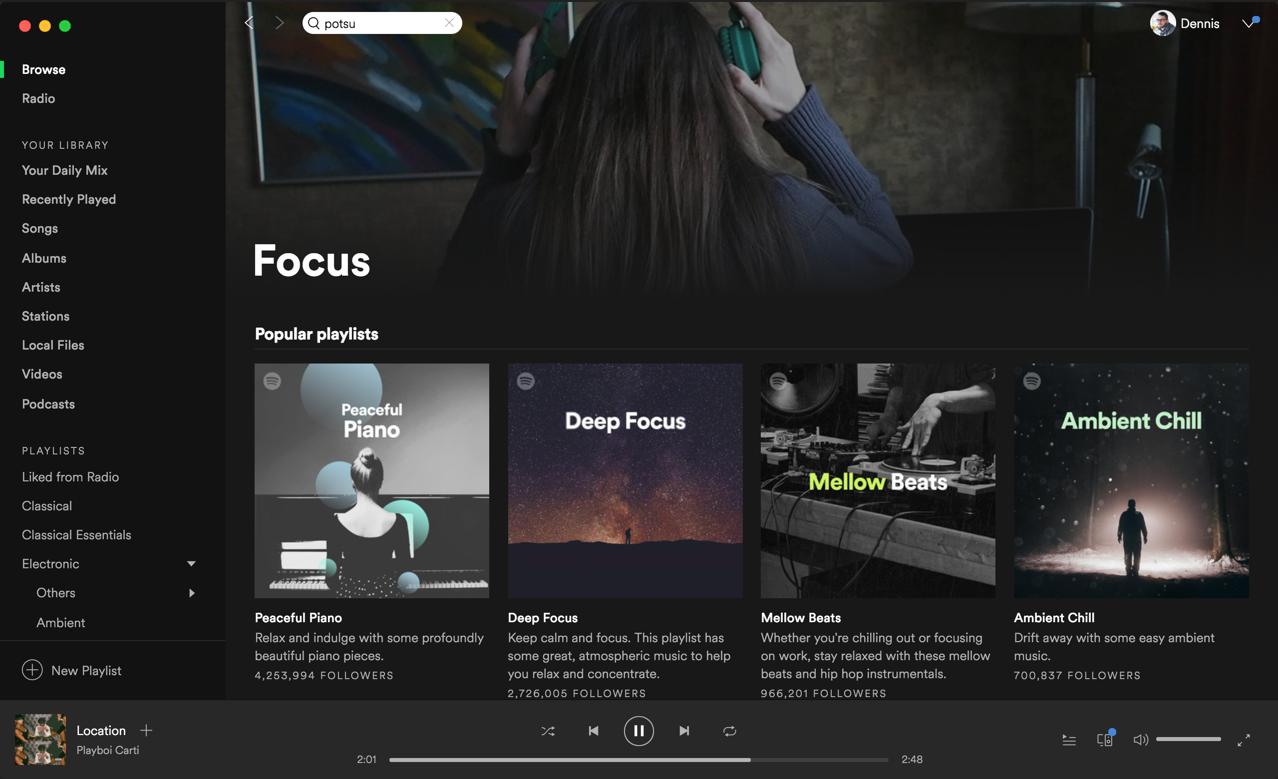
Discover New Music with Featured Playlists
Under Browse in your sidebar you’ll find a tab named Genres and Moods which is by far the best place I’ve found for discovering new tracks and artists on Spotify. Spotify’s editors curate the playlists you’ll find on these pages and are able to browse by both the mood you’re looking for or the genre you’re interested in.
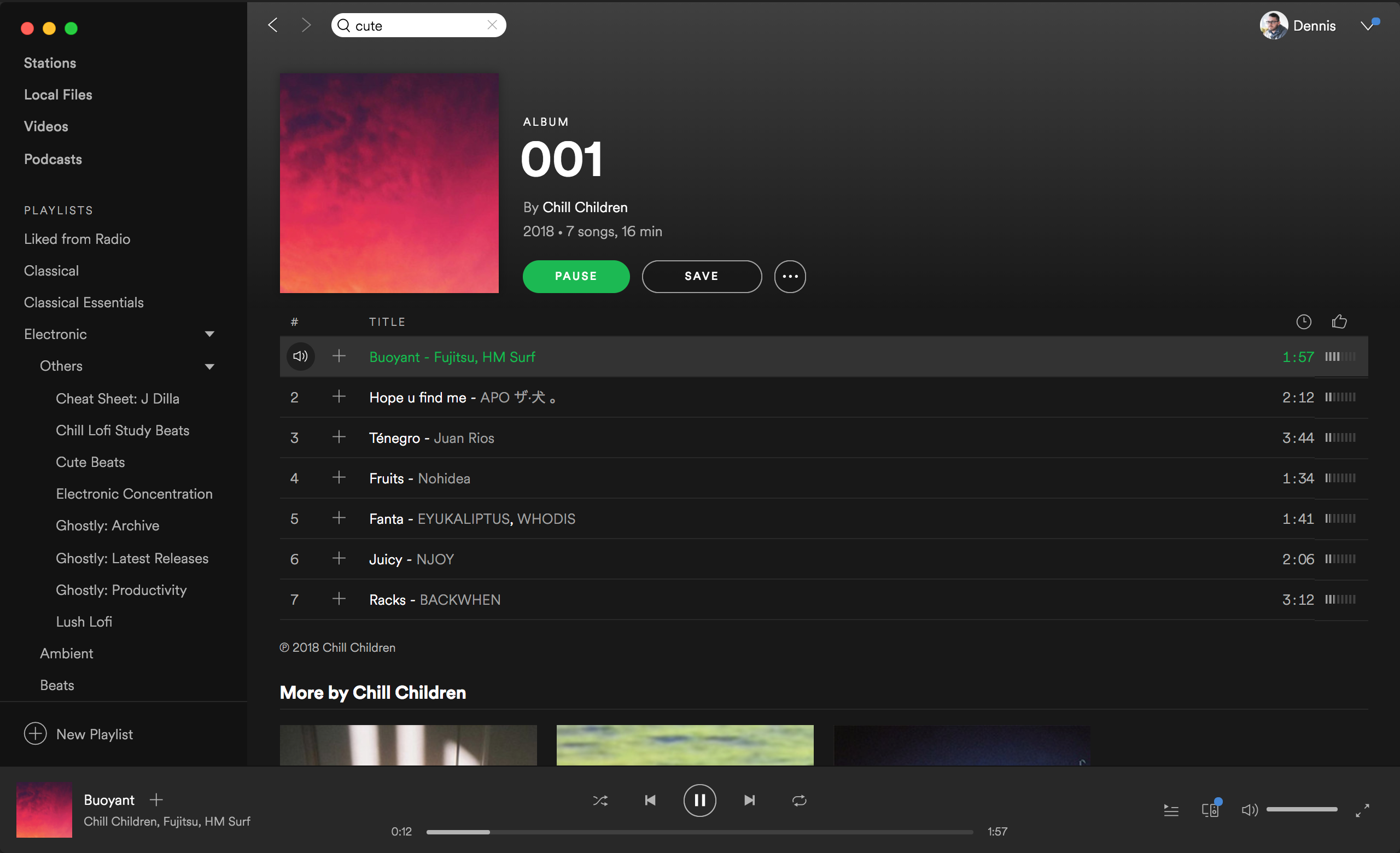
The playlists within here go from general to very niche styles and you’re able to endlessly find new genres that peak your interest. For example, I recently found a great playlist named Cute Beats. Weird sounding I know, but it ended up being a niche I found that I really liked. This has happened a few times for me and have found a few artists I really enjoy through these playlists so I recommend digging through these for playlists to follow now and then.
Discover New Music with Albums from Songs Discovery
Tagging along off of Featured Playlists, finding new music through the tracks in these playlists is helpful as well. When I find a track from these playlists I really like, I’ll look into that artist’s other music that they have put out. Usually I find some more great music through other songs on that album or even on their entire profile. I’ve found some of my favorite tracks and artists through this method.
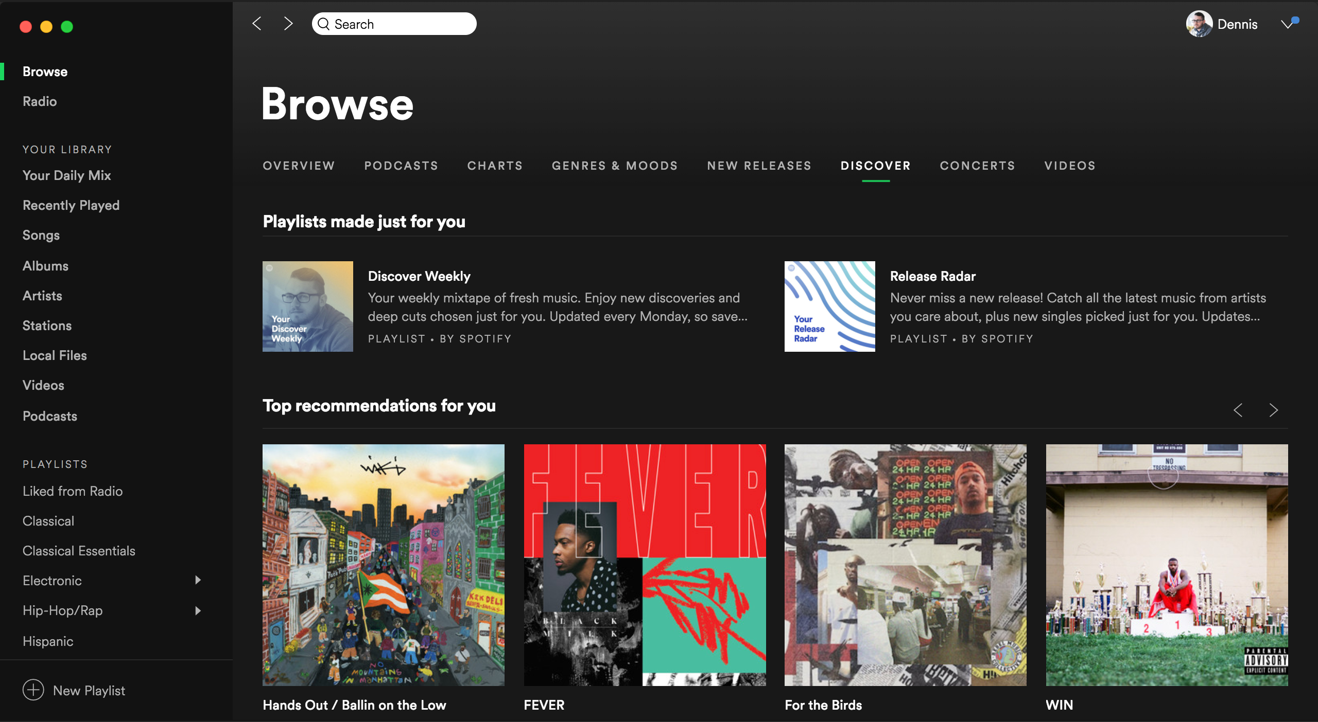
Discover New Music with the Discover Tab
Under Browse in your sidebar you’ll also find a handy tab appropriately named Discover. Here you will find a plethora of ways to find music similar to what you listen to and enjoy.
Discover Weekly is a hit or miss usually, but a great place to find new music weekly based on your listening patterns. Release Radar is a neat playlist that keeps tracks of the latest releases from artists that you follow on their Spotify profile. This is a nice way to find new music from your favorite artists without having to keep track of all of their releases.
You’ll also get Top Recommendations for You and New Releases for You which are a nice way to see the most relevant music based on your listening patterns. After that you’ll get recommendations based on specific artists you have listened to recently. This section isn’t as helpful in my experience but can lead to some gems here and there.
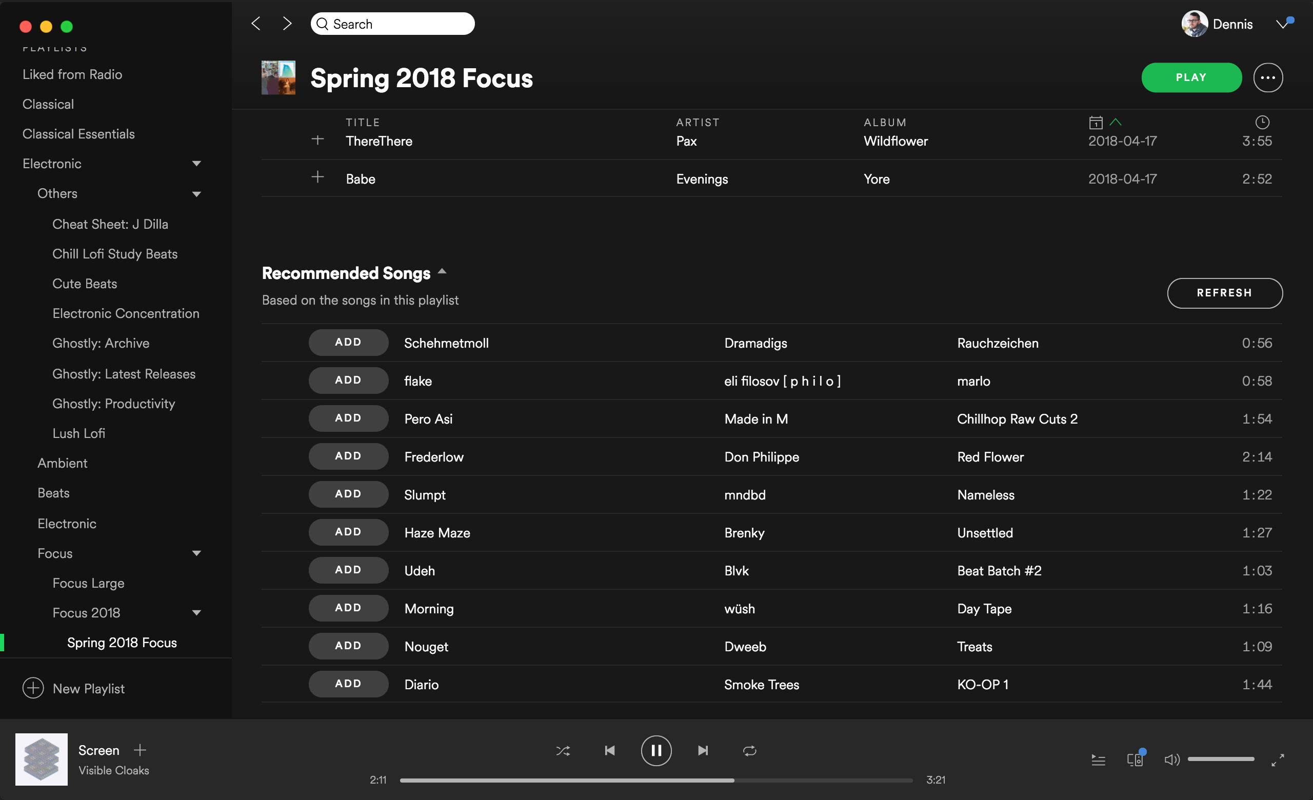
Discover New Music with Recommended Songs
At the end of your playlists you’ll find a Recommended Songs section that acts sort of like a mini Discovery tab within your playlists. Spotify takes the tracks that you have in this playlist and will recommend songs that are similar to the tracks and mood on this playlist.
This overall has been a great place after I’ve gotten through one of my playlists and want some new similar additions. You can even press refresh in the top right to have Spotify bring in even more tracks for you to listen to!
Hope this will help you find some new great music to listen to and if you need something on the ambient side of things, be sure to check out my music that I make here and on all streaming platforms. Enjoy!

Since joining MetaLab a few months ago, I’ve had to transition back into daily stand-ups after not having them since I worked at Satchel last year. While stand-ups are incredibly useful in a work setting, it definitely takes some preparation and getting used to or can lead to miscommunication or even be action-less at the end.
Here are some tips I’ve implemented for myself that you may find useful for your own standup preparation:
Write down tasks you complete throughout the day
At first I thought I could remember off the top of my head everything that I did the day before but I was completely wrong. Some days I would forget a few tasks that were completed and would jeopardize deadlines or personal task lists.
Instead, I now keep a notebook next to me throughout the day at my desk and I write down each tasks I finish that day no matter how big or how small the task is. Then the next day I have an accurate list ready to go and talk through with my team.
Write down specific blockers you had during the day
Sometimes I’ll have some software issues during the day (cough InVision cough) that can put an hour or so dent into my workday. Or sometimes I’ll be waiting for another task to be completed by another team member before I can proceed. Addressing these blockers in stand-ups is crucial to be transparent with your team and your team may have advice on how to better approach these blockers next time you face them.
Leave stand-ups with clear action items
Ever leave a stand-up and need to think for a second about what actually needs to get done? No, just me? All joking aside, this is an obvious but important one. Make sure you have a clear picture of the goals for your tasks that day and what needs to get done for that day. It helps!
Ask for prioritization of tasks for that day
A genuine mistake I used to make was not asking for prioritization of tasks. Some tasks needed to be done before others for client presentations or calls so it was important to put those first.
Not asking for priority level on tasks can lead to interference with the schedule and tasks of others which you definitely don’t want to be the cause of. Prioritizing your tasks for the day also allows for some leeway if not every task gets done because you got the most important ones out of the way at least.

© 2012 - 2026