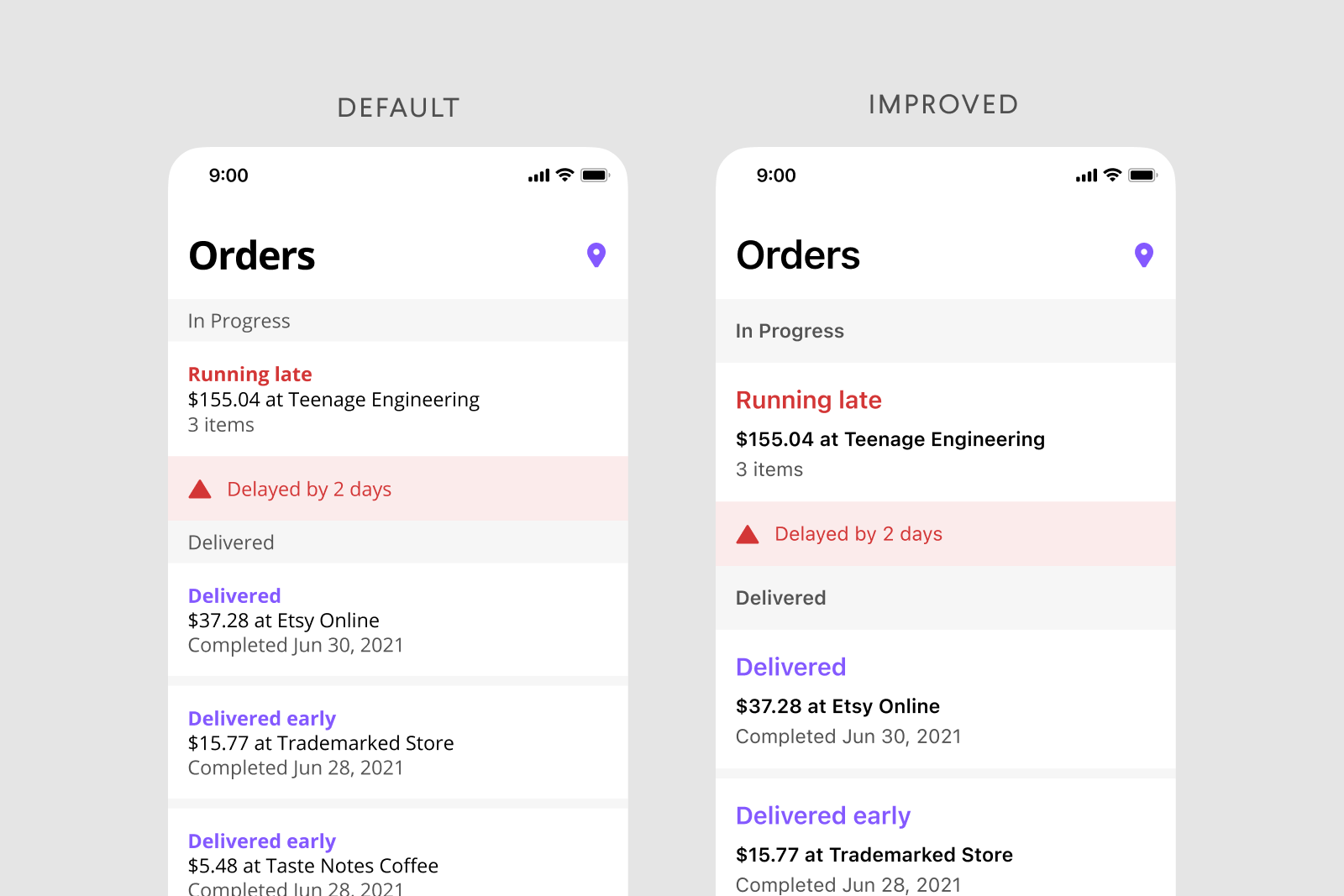
Here are some basic tips to improve typography in design I've learned over the last 10 years. Helpful for all areas and types of design.
One of my biggest struggles starting out in Product Design was the ability to make consistent color palettes. Creating typography and color palettes that worked within product constraints without sacrificing recognizability on countless screens. I needed a reliable way to experiment with composition without ditching pre-existing styles and screens. Using different shades of grays, sacrificing accessibility, and not knowing when or how to use colors without a strict system in place was frustrating and limiting.
After a long time of experiencing this frustration, once I started learning to code a few years ago things clicked for me. I could use opacity! With opacity, I could blend layers of elements together and still maintain a harmonious color palette, build more accessible products, experiment with layout more, and take another problem off my plate to think through.

Using in Product Design Practice
Using different shades of grays with determined hex codes can lead to poor contrasts between elements and leave interfaces inconsistent, inaccessible for some users, and even just plain ugly sometimes. Instead, I found using a pure white and a pure black (or with a tiny amount of hue if you’d like!) as a starting point and taking advantage of opacity to be a much better tactic. This makes it much easier to develop color palettes, design systems, product iterations, and work better (and quicker!) towards product goals.
Not making sense yet? No worries! Here’s a visual:
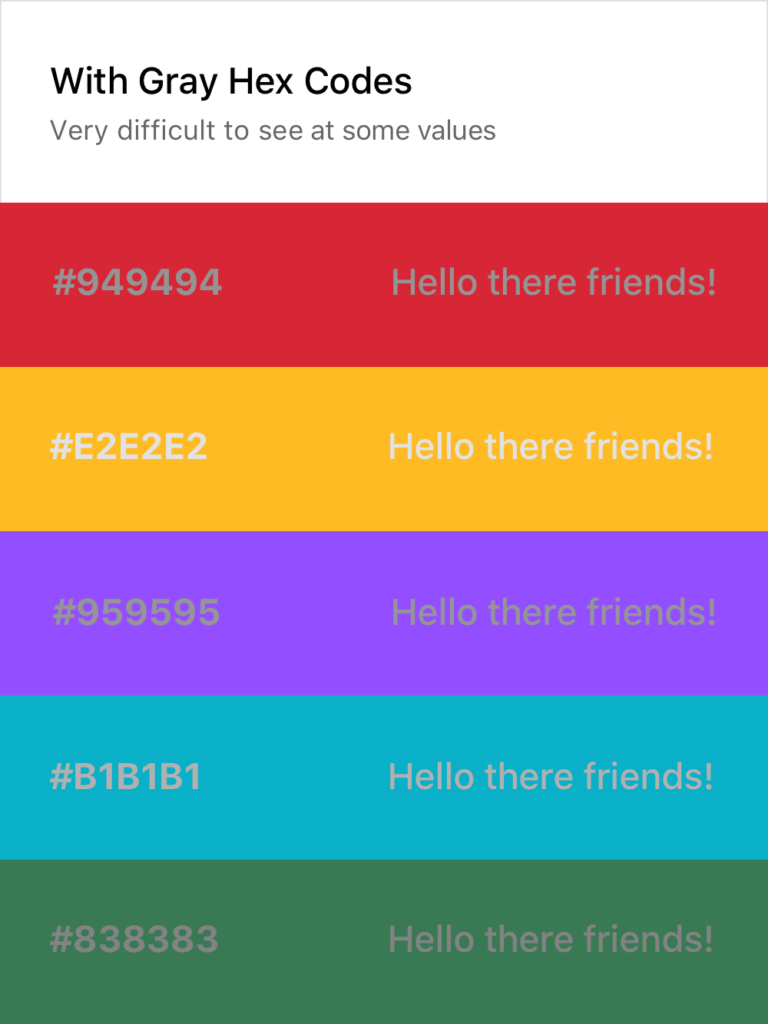
As you can see, the usual approach on the left makes it quite difficult to consistently create text that is legible without using a pure white or black on top of the color or having a very specific and well-maintained system in place. Both of these solutions are tedious and hard to implement across teams and passing off to developers.
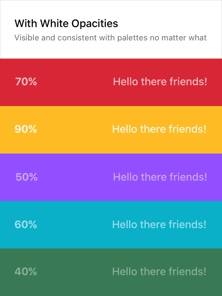
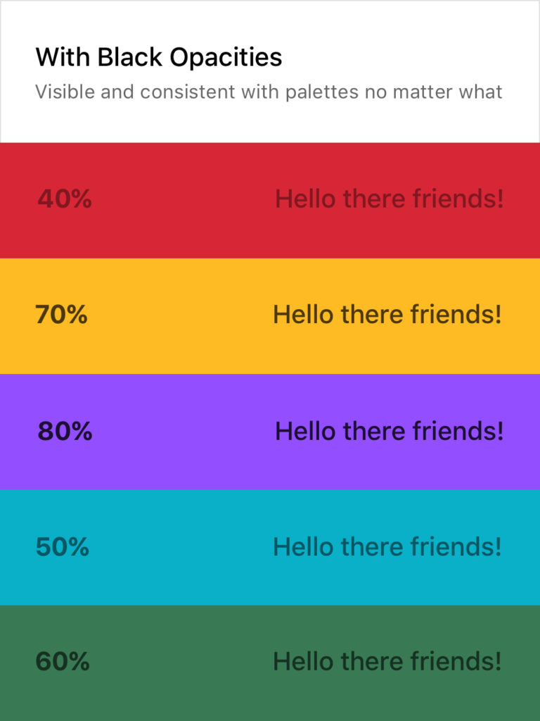
Setting Typography Rules for Color in Product Design
The white and black opacity approaches on the right are consistently legible and don’t require verbose rules and guides to follow. Although the ones above are random, I usually stick to 20%, 40%, 60%, 80%, and 100%, giving each their specific use case. This dwindles the amount of rules to remember down quite a bit and still provides enough flexibility to build a system around them while promoting experimentation in screen layouts and UX decisions.
Of course, there are still limitations here. Some of the examples above could do with a higher or lower opacity to make them 100% AAA compliant. For example, you wouldn’t want to put 20% white text on top of a yellow color or a 80% black text on top of a dark purple. It’s important to keep those in mind as well, but this post is more to provide a basis for building a better system, not so much a cheat sheet and an answer to everything.
If you want a real-life example, my personal website (https://www.cortes.us) is built entirely with different opacities of white and black for text mixed with colors throughout.
What About Passing to Developers?
Okay so now you may be asking yourself how you can communicate this system with a developer and how it would work in code. It’s actually quite simple! Luckily for you, both mobile (yes, native too) and web technologies support an RGBA function as a way to specify color values. How does this work? Here’s a little key and example:
rgba(230,18,75,0.5);

// the first 3 numbers are your R, G, and B values (0 - 256).
// the last digit is the alpha, or opacity in our case
  // pass in a decimal number equal to the opacity you want


// EXAMPLES

// For a black at 5% opacity
color: rgba(0,0,0,0.05);

// For a white at 80% opacity
color: rgba(256,256,256,0.8);
And voilà! You can create a key very simply for developers like you normally would with a style sheet of some sort, just exchange hex codes for RGBA function values for your neutral colors. I’d also recommend creating a guide around when and where to use certain opacities (40% black with uppercase text at .875rem for secondary titles for example).

© 2012 - 2026