So it's your first week in a new design role, what do you do? What should you have prepared? Here are 10 ways to set yourself up for success.
Here are some basic tips to improve typography in design I've learned over the last 10 years. Helpful for all areas and types of design.
One of my biggest struggles starting out in Product Design was the ability to make consistent color palettes. Creating typography and color palettes that worked within product constraints without sacrificing recognizability on countless screens. I needed a reliable way to experiment with composition without ditching pre-existing styles and screens. Using different shades of grays, sacrificing accessibility, and not knowing when or how to use colors without a strict system in place was frustrating and limiting.
After a long time of experiencing this frustration, once I started learning to code a few years ago things clicked for me. I could use opacity! With opacity, I could blend layers of elements together and still maintain a harmonious color palette, build more accessible products, experiment with layout more, and take another problem off my plate to think through.

Using in Product Design Practice
Using different shades of grays with determined hex codes can lead to poor contrasts between elements and leave interfaces inconsistent, inaccessible for some users, and even just plain ugly sometimes. Instead, I found using a pure white and a pure black (or with a tiny amount of hue if you’d like!) as a starting point and taking advantage of opacity to be a much better tactic. This makes it much easier to develop color palettes, design systems, product iterations, and work better (and quicker!) towards product goals.
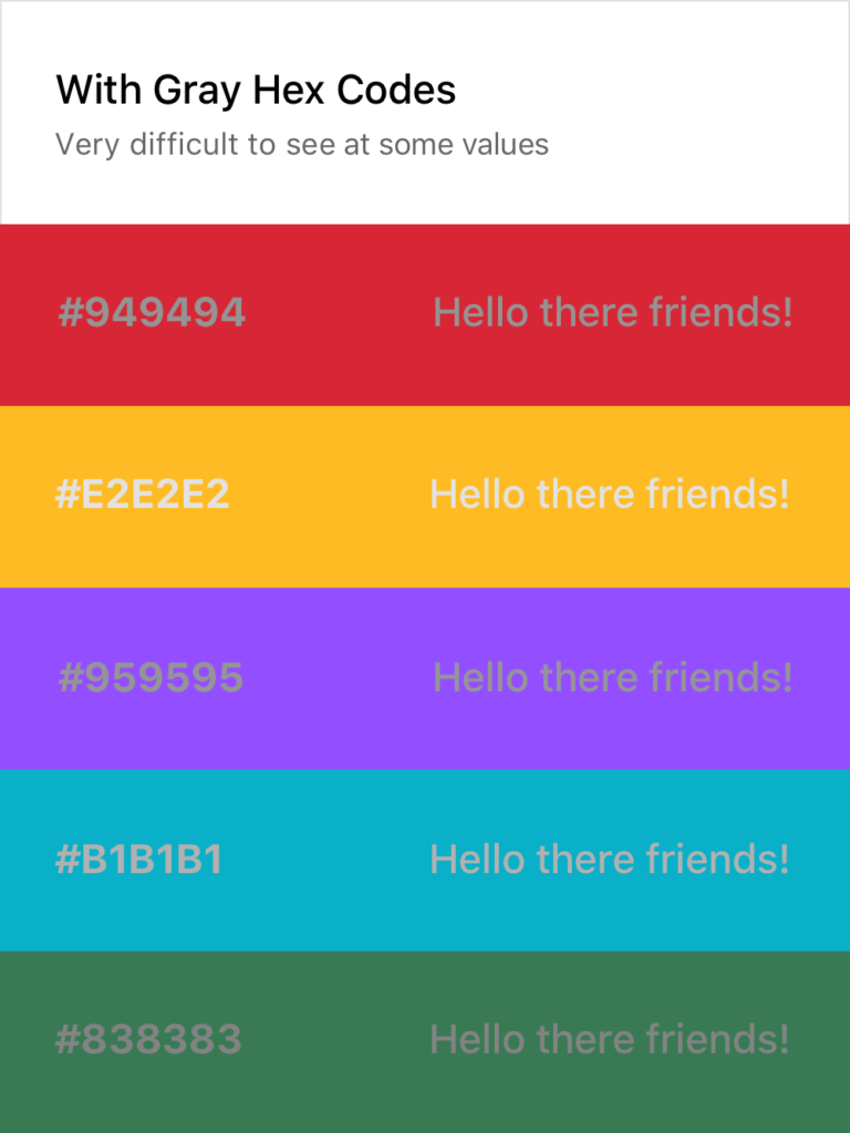
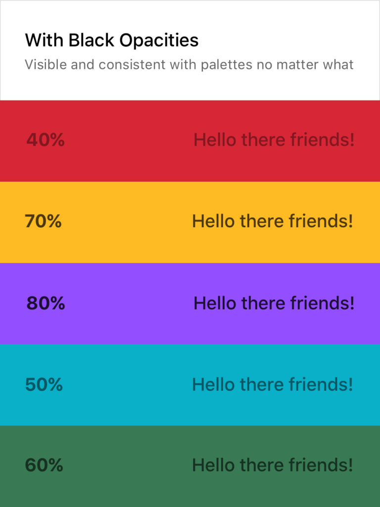
Not making sense yet? No worries! Here’s a visual:
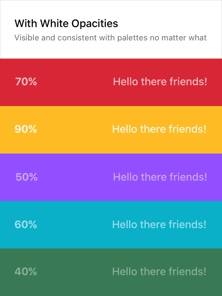
As you can see, the usual approach on the left makes it quite difficult to consistently create text that is legible without using a pure white or black on top of the color or having a very specific and well-maintained system in place. Both of these solutions are tedious and hard to implement across teams and passing off to developers.
Setting Typography Rules for Color in Product Design
The white and black opacity approaches on the right are consistently legible and don’t require verbose rules and guides to follow. Although the ones above are random, I usually stick to 20%, 40%, 60%, 80%, and 100%, giving each their specific use case. This dwindles the amount of rules to remember down quite a bit and still provides enough flexibility to build a system around them while promoting experimentation in screen layouts and UX decisions.
Of course, there are still limitations here. Some of the examples above could do with a higher or lower opacity to make them 100% AAA compliant. For example, you wouldn’t want to put 20% white text on top of a yellow color or a 80% black text on top of a dark purple. It’s important to keep those in mind as well, but this post is more to provide a basis for building a better system, not so much a cheat sheet and an answer to everything.
If you want a real-life example, my personal website (https://www.cortes.us) is built entirely with different opacities of white and black for text mixed with colors throughout.
What About Passing to Developers?
Okay so now you may be asking yourself how you can communicate this system with a developer and how it would work in code. It’s actually quite simple! Luckily for you, both mobile (yes, native too) and web technologies support an RGBA function as a way to specify color values. How does this work? Here’s a little key and example:
rgba(230,18,75,0.5);

// the first 3 numbers are your R, G, and B values (0 - 256).
// the last digit is the alpha, or opacity in our case
  // pass in a decimal number equal to the opacity you want


// EXAMPLES

// For a black at 5% opacity
color: rgba(0,0,0,0.05);

// For a white at 80% opacity
color: rgba(256,256,256,0.8);
And voilà! You can create a key very simply for developers like you normally would with a style sheet of some sort, just exchange hex codes for RGBA function values for your neutral colors. I’d also recommend creating a guide around when and where to use certain opacities (40% black with uppercase text at .875rem for secondary titles for example).
Let’s admit it. Creating color palettes in Product Design is a tough feat to do well, and there doesn’t seem to be much of a process besides trial and error usually for figuring out what will work best in context.
While this is true, there is an approach you can take that will put you on the right path with opacities, similarly to my post last week on Text Colors in Product Design. Let me explain!
Primary Brand Color
If you work at a company, chances are that your primary brand color is settled upon at this moment. The basis of this process relies on your brand primary color as that will be what users will most likely see throughout the application. Using your brand color as a starting point will keep this process and color palette harmonious and consistent. For simplicity’s sake, I’m going to start with this purple as the primary brand color in my example.

Brand Black
Now, using my primary brand color, I’m going to create a black that is on brand with my primary color. I recommend not using a pure black color in the product you are working on (unless you’re brand color is pure black, then that works ¯\_(ツ)_/¯) as it can feel stark and inconsistent with other colors you are using.
It’s simple to do this, just start with your brand color (our purple in this case) and bring your slider straight down (or even down and a little to the right for saturation) until you reach a comfortable “black” that contains hue from your primary brand color without getting to the bottom. See below!
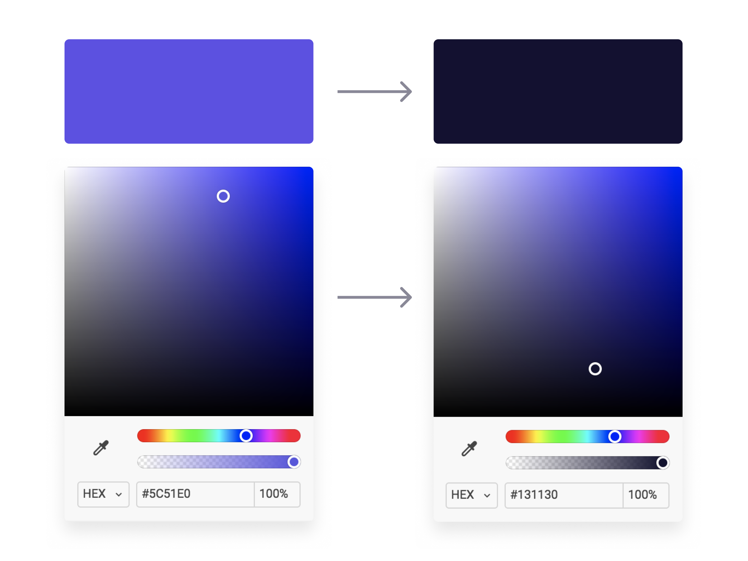
Now we have a “black” that is dark enough to use how we would normally use a black (text, background, etc.) but it won’t feel stark or contrasted when paired with our primary brand color. The cool hue provides familiarity to our “black” and serves as a basis for building out the rest of our color palette. Speaking of, let’s move on to opacities!
Opacity Galore
With our Brand Black created, we can now easily generate a color system to be used on elements and backgrounds throughout our product using opacities. I took our Brand Black and made 5 other copies, lowering the opacities by 20% until the last one where I go to 5% for light backgrounds keeping the background as a solid #FFFFFF white. Then, I do the same with a dark background using a pure #FFFFFF as the basis and lower the opacities the same way I did for the Brand Black. See below!
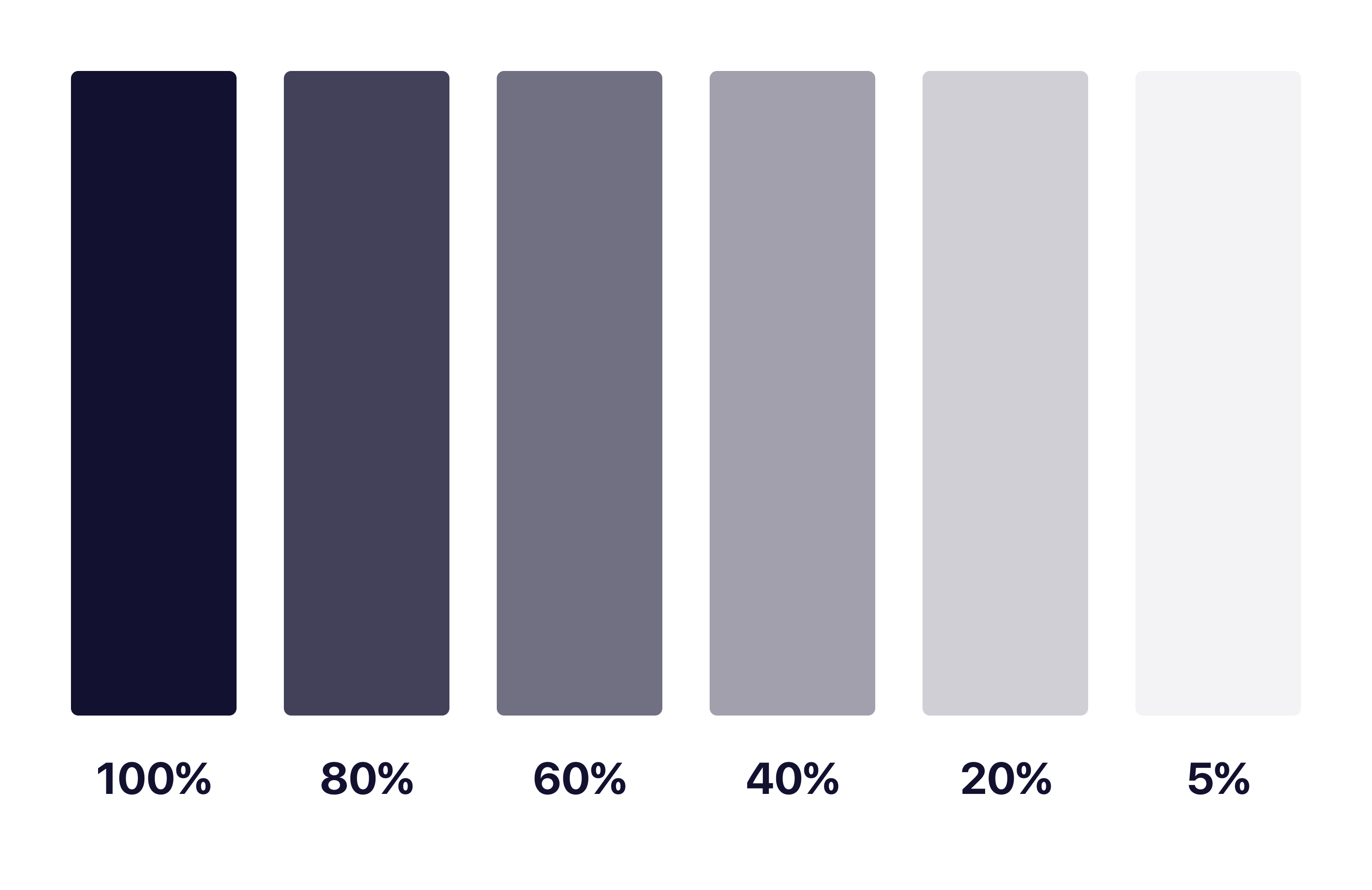
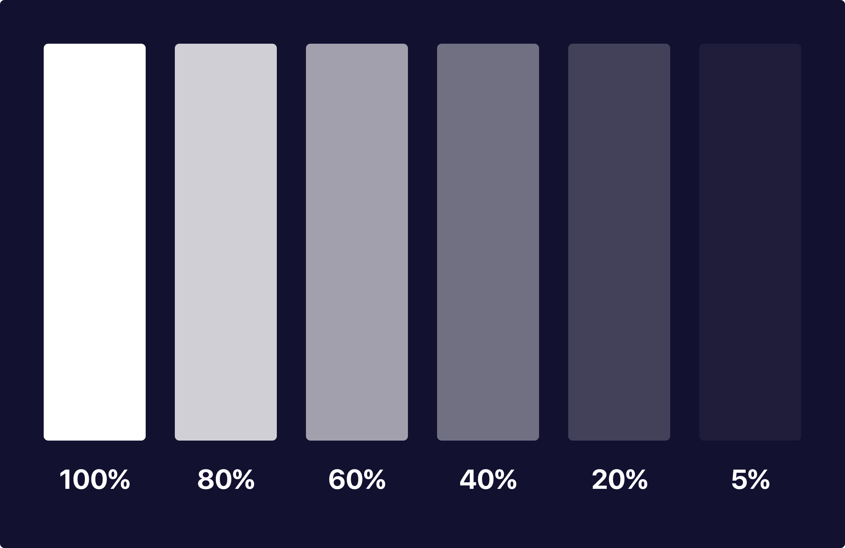
As you can see, each of these colors have the same base hue and keeps them looking and feeling consistent as a palette throughout your application. No more having to guess what colors and hues will match with endless trial and error testing!
With matching hues, these neutral tones will serve as a basis for colors of different neutral elements. I tend to make a key for what each one of these will represent, and using them together makes for interesting combinations of elements that you can use to your advantage in different scenarios.
In Product Design Practice
Here’s a quick concept example I made using the brand color and opacities I mentioned above:

As you can see, each of the colors have a mixed hue of our primary brand purple color while keeping the overall feel and accessibility consistent for users. None of the colors feel stark or out of place and we have the ability to use our brand color as actions with neutral elements not feeling out of place or distracting.
What About Passing to Developers?
Okay so now you may be asking yourself how you can communicate this system with a developer and how it would work in code. It’s actually quite simple! Luckily for you, both mobile (yes, native too) and web technologies support an RGBA function as a way to specify color values. How does this work? Here’s a little key and example:
rgba(230,18,75,0.5);

// the first 3 numbers are your R, G, and B values (0 - 256).
// the last digit is the alpha, or opacity in our case
  // pass in a decimal number equal to the opacity you want


// EXAMPLES

// For a black at 5% opacity
color: rgba(0,0,0,0.05);

// For a white at 80% opacity
color: rgba(256,256,256,0.8);
And voilà! You can create a key very simply for developers like you normally would with a style sheet of some sort, just exchange hex codes for RGBA function values for your neutral colors. I’d also recommend creating a guide around when and where to use certain opacities as a guide for your design team and development team to keep this usage consistent for user patterns.
Hope you found this useful and insightful!
As of when I am writing this, I am starting my first day at my new job tomorrow. I’ll be starting as a Product Designer at Dave, a financial tech company based in Los Angeles.
While looking for the next place to call home for my work life, culture was one of the biggest deciding factors for me. I believe that working with folks you can also call your friends outside of a work setting makes for the best outcome and work ethic at a company.
However, outside of culture, I was also looking for a role that was slightly out of my grasp and knowledge of prior experience. I was looking for something unfamiliar and that I hadn’t yet mastered. I’ve learned over my time in the industry that the best way to stay happy and challenged at a job is to work on things you haven’t had the exact experience with. It keeps you on your toes, keeps you learning, and keeps you yearning to get even better at what you do. You quickly realize you aren’t a master at your field, yet you can be a master at managing and improving how you approach each of these unique experiences.
Dave for me was a great step in the right direction for my career. At Dave I’ll be working on designing the future of finance as someone who has never designed specifically for this field, and for a change my job won’t only rely on what is looked at on screens. I’ll be working on designing real life experiences from brand to packaging and more. On top of that, I’m the first designer to be full-time at the company besides the CPO. As a result I’ll be working on developing a process around how design works with other parts of the company and probably even hiring and leading other designers as we begin to grow the team.
How this applies to your career and how you work can go many different ways, but I think the overall guidance of looking for something you feel confident yet unfamiliar with is a good place to start. The exciting part of life are the times we apply ourselves to overcome new obstacles, leading to a better you. Having the foundational skills for the job to rely on while using the rest of your skillset to learn and adapt I have found to be the best teacher in life, no matter how many mentors I have or books I read.
Over the 5+ years I have been working in the tech world on websites and products, I’ve come to learn that the combination of many small details come together to make the final work great. Things like typography, grid systems, alignment, and even spacing can really make a difference in the overall look and feel of a product.
While this may seem obvious, it’s most likely more detailed than you’d think. I know it was for me when I was first starting out. My boss/mentor a few years ago had a big impact on my approach to these details. If what I was working on had a small spacing issue or even a couple typos, I had to redo the screen and make it better somehow each time it happened.
It might feel like this was a waste of time from an outside perspective, but it was quite impactful for me. This practice helped me really dial in on high-quality and detail-oriented work. I developed a keen eye for catching small details and mistakes (not only in my work, but the work of others which has been helpful in a team setting) and has lead to much more refined work. This has made me much more careful in my work as well and has helped me avoid typos, kept spacing consistent, watch for alignment, etc.
Here are a few high-level tips that may be helpful, make sure to double check each of these often, especially before a review day:
Typography
- Create a system and use case for typography sizes and spacing.
- Make sure all your leading is tall enough for legibility—default values aren’t always the best option.
- Use 2 typefaces max and assign each to their own use cases.
- Use 3 font weights max and assign them to sizes or use cases.
- Use system fonts when possible.
- Give type space to breathe, makes it easier to read and digest for users.
Use a Consistent 8pt Grid
- You can read about the 8pt grid and how to use/create one here and here
- Keeps you from guessing and “eye-balling” spacing of elements
- Helps you work faster and more consistently
- A great foundation for quality design work
Double Checking
This is a big one that’s overlooked, a lot of the time designers are in a rush to get something shipped and don’t double check work. I see it all the time, trust me!
- Check for typos, goes a long way in presentations and avoiding copy confusion.
- Make sure your alignment is consistent, even a few pixels off here and there can have a bigger impact than you’d think.
- Make sure your spacing is not only consistent, but visually correct. For example, containers are actually better visually when the vertical space is a bit more than the horizontal space. Designers tend to always make these the same but visually they won’t look correct to a user.
- Check that you are using a consistent color palette and don’t have legacy colors or mistakes. Inconsistent colors are a sure way to lose trust from users subconsciously.
At the end of the day, these should obviously come after time and effort put into figuring out core features and the experience of a product. I find that iterating quickly at the beginning of a project without giving too much thought into details is better. Afterwards I come back through and clean up files with the above in mind to not limit myself or spend too much time on things that aren’t crucial to a product at first.
Hope you found this helpful!
Apple’s iPad is advertised as a stand alone device that can replace a laptop, but for many this definitely isn’t the case yet. For example, as a Product Designer, I can’t open Sketch or Abstract and go to town on my design files. Or as a developer I can’t reliably code and run a local server to work on a project.
As someone who bought a 12.9" iPad Pro a couple years back, I was hoping this would change. While I can’t do exactly what I mentioned above in the way I would like to, I’ve been able to find ways to bring the iPad more and more into my workflow for design work.
Research and Notes
A spot where the iPad can really shine is in the research phase of work. Research typically only requires a web browser and a way to document your findings which makes the iPad’s split screen perfect for the job.

My setup consists of a Chrome browser open on the left of my screen and default Apple Notes on the right. You can of course switch these out for whichever replacements you’d like (Google Docs, Dropbox Paper, etc). The side-by-side apps lets me enlarge and shrink windows as I need and even lets me drag and drop both text and media from my browser on to my Notes. This lets me seamlessly mix documentation with my own thoughts and findings. Throw my Apple Pencil into the mix for drawing extras on notes and I’m set for getting my notes complete and organized.
I’ve used this method on countless projects as I really enjoy the mobile aspect of an iPad versus a laptop. Working on the couch or outside or at a coffee shop with a smaller form factor is great. Not to mention mixing touch with writing and drawing (Apple Pencil) is a delight that I think is tough to find in products.
Wireframing
By far my favorite part of design work on an iPad. While there are definitely different ways you can do this depending on your style, I’ll give some recommendations based on my preference.

Pattern is a favorite app of mine for wireframing. Despite some limitations (no zooming, some tedious editing aspects), Pattern is great for basic wireframing of design screens. The app provides a minimal but useful interface with some delightful interactions for creating interfaces. I personally enjoy the Apple Pencil capabilities as well for making notes directly on your wireframes.
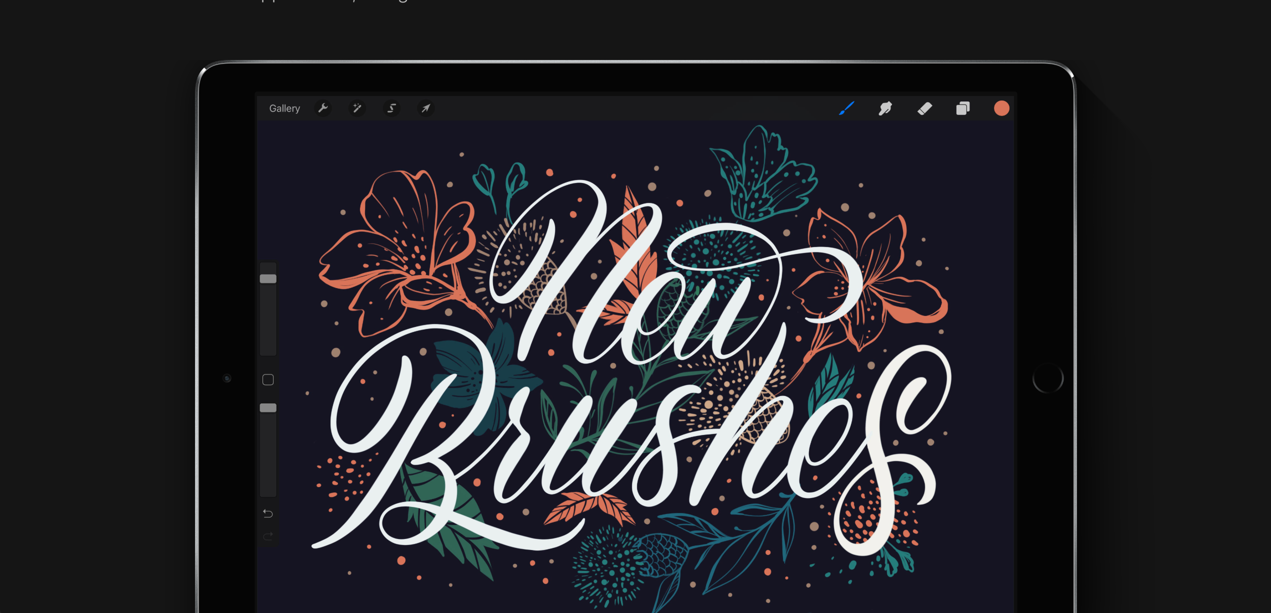
Procreate, while considered more of an app for art, is great for wireframing as well. It’s definitely more difficult to create refined shapes and lines like you can in Pattern, but the layering and editing capabilities can make up for this depending on what you’re looking for.
Inspiration
While producing work is important, consuming of inspiration and other subjects is an paramount in your creative process as well. Luckily, there are a plethora of ways to do this with an iPad. Using a browser the same way you would on a computer to browse you bookmarks and favorite websites is a sure way to do this.
In terms of apps to use, Pinterest is an obvious one for most folks and happens to be a favorite of mine as well. While following people on Pinterest has become pretty obsolete nowadays due to their home feed changes, Pinterest does a great job of feeding relevant posts related to pins you have saved before.
While there are other apps to use such as the Adobe suite, the apps and methods I listed above are the way I personally use my iPad within my product design workflow on an almost daily basis outside of hifi work. Hopefully we’ll see this change in the future and be able to do full-fledged design work but for now this is the method I use.
© 2012 - 2026
