Let’s admit it. Creating color palettes in Product Design is a tough feat to do well, and there doesn’t seem to be much of a process besides trial and error usually for figuring out what will work best in context.
While this is true, there is an approach you can take that will put you on the right path with opacities, similarly to my post last week on Text Colors in Product Design. Let me explain!
Primary Brand Color
If you work at a company, chances are that your primary brand color is settled upon at this moment. The basis of this process relies on your brand primary color as that will be what users will most likely see throughout the application. Using your brand color as a starting point will keep this process and color palette harmonious and consistent. For simplicity’s sake, I’m going to start with this purple as the primary brand color in my example.

Brand Black
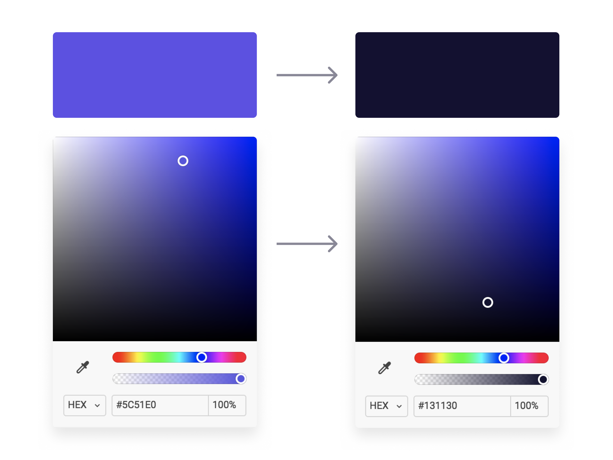
Now, using my primary brand color, I’m going to create a black that is on brand with my primary color. I recommend not using a pure black color in the product you are working on (unless you’re brand color is pure black, then that works ¯\_(ツ)_/¯) as it can feel stark and inconsistent with other colors you are using.
It’s simple to do this, just start with your brand color (our purple in this case) and bring your slider straight down (or even down and a little to the right for saturation) until you reach a comfortable “black” that contains hue from your primary brand color without getting to the bottom. See below!

Now we have a “black” that is dark enough to use how we would normally use a black (text, background, etc.) but it won’t feel stark or contrasted when paired with our primary brand color. The cool hue provides familiarity to our “black” and serves as a basis for building out the rest of our color palette. Speaking of, let’s move on to opacities!
Opacity Galore
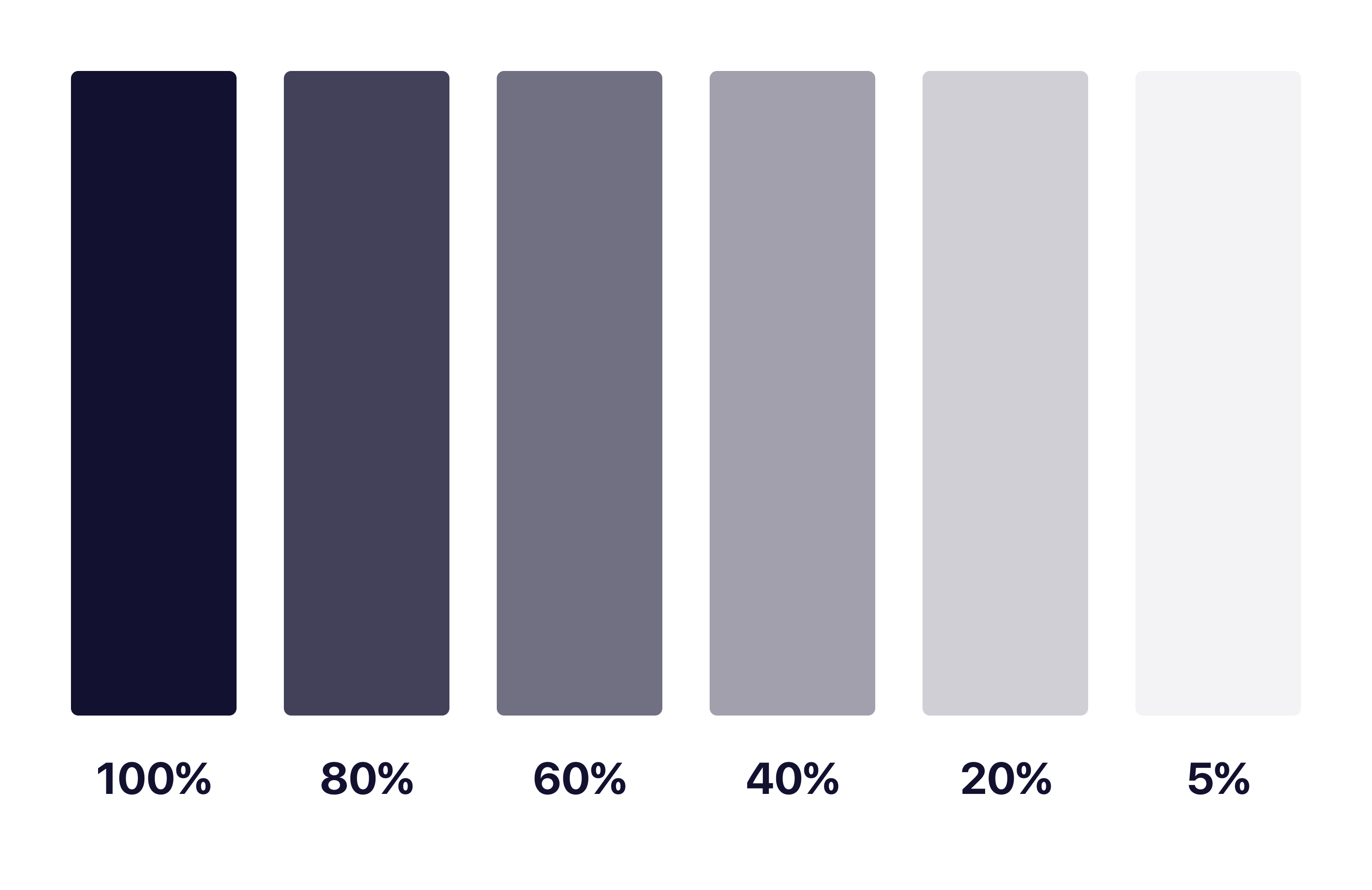
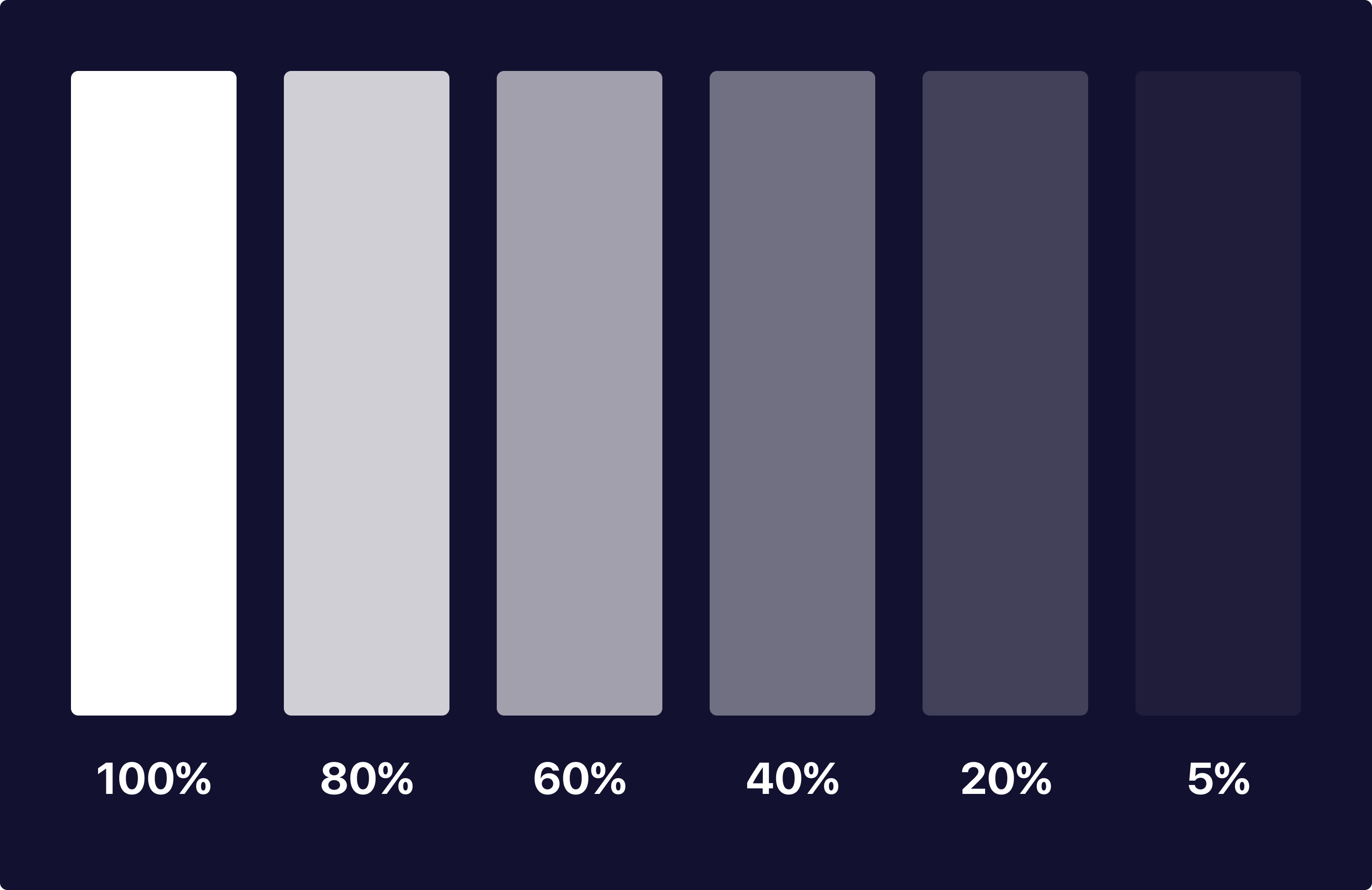
With our Brand Black created, we can now easily generate a color system to be used on elements and backgrounds throughout our product using opacities. I took our Brand Black and made 5 other copies, lowering the opacities by 20% until the last one where I go to 5% for light backgrounds keeping the background as a solid #FFFFFF white. Then, I do the same with a dark background using a pure #FFFFFF as the basis and lower the opacities the same way I did for the Brand Black. See below!


As you can see, each of these colors have the same base hue and keeps them looking and feeling consistent as a palette throughout your application. No more having to guess what colors and hues will match with endless trial and error testing!
With matching hues, these neutral tones will serve as a basis for colors of different neutral elements. I tend to make a key for what each one of these will represent, and using them together makes for interesting combinations of elements that you can use to your advantage in different scenarios.
In Product Design Practice
Here’s a quick concept example I made using the brand color and opacities I mentioned above:

As you can see, each of the colors have a mixed hue of our primary brand purple color while keeping the overall feel and accessibility consistent for users. None of the colors feel stark or out of place and we have the ability to use our brand color as actions with neutral elements not feeling out of place or distracting.
What About Passing to Developers?
Okay so now you may be asking yourself how you can communicate this system with a developer and how it would work in code. It’s actually quite simple! Luckily for you, both mobile (yes, native too) and web technologies support an RGBA function as a way to specify color values. How does this work? Here’s a little key and example:
rgba(230,18,75,0.5);

// the first 3 numbers are your R, G, and B values (0 - 256).
// the last digit is the alpha, or opacity in our case
  // pass in a decimal number equal to the opacity you want


// EXAMPLES

// For a black at 5% opacity
color: rgba(0,0,0,0.05);

// For a white at 80% opacity
color: rgba(256,256,256,0.8);
And voilà! You can create a key very simply for developers like you normally would with a style sheet of some sort, just exchange hex codes for RGBA function values for your neutral colors. I’d also recommend creating a guide around when and where to use certain opacities as a guide for your design team and development team to keep this usage consistent for user patterns.
Hope you found this useful and insightful!


THanks for the tips! 🙂
Easy and efficient.