Working on typography in design is arguably one of the most important elements of your design work. Communication in your designs, whether it be for product design, UX design, web design, or graphic design comes primarily from your treatment of typography. Typography is how we communicate language and written words, and is a cornerstone in the foundations of design. Practical typography tips are hard to come by, so I wanted to create my own for reference.
I've been designing products for almost 10 years now and have worked at both design agencies (MetaLab and Vrasa) and in-house at successful startups (Mothership, Dave, and Satchel Health). Over time, I've picked up on certain patterns that work well when designing with typography. I've incorporated these tips into the design teams I've worked on and lead, bringing these foundational tips into everything from our marketing websites to our design systems. Today, I'll share those tips with you!
Quick reminder that I do have a Patreon where I share early videos, content, and extra behind the scenes that you can't get anywhere else. Join my Patreon here →
Tip 1: Create a system and use case for typography sizes and spacing
The first of my practical typography tips is to create a system and use case for typography sizes and spacing. If you create a system that you can always rely on when you're working, then you'll be able to spend less time thinking about the treatment of each place you use text and can focus on solving the problem at hand. Creating a system for your typography removes time getting bogged down on details and gives more time to focus on creating a great user experience instead.
From a practical perspective, both Figma and Sketch have ways to create what they call text styles. Text styles are basically text components that provide a way to save a certain format and style of text that you can reuse anywhere, just by selecting the one you need for that instance. Text styles in Figma and Sketch make it easy to use consistent typography styling at scale, and allows for global changes to these styles. You can read more about text styles in Figma here, and more about Sketch text styles here.
If you're unsure how to approach creating text styles from a holistic level or from a design system perspective, I highly recommend watching my video on How to Choose Text Styles and Sizes in Design for Design Systems, Apps, and Websites.
Tip 2: Make sure all your line height is tall enough for legibility
The second of my practical typography tips is around improving line height. When I'm working with less experienced designers, I often notice that they rely on default values for typography in their design work. While default values are created by the typeface designer themselves, they aren't always crafted with design work in mind. In my experience, default line height tends to be a bit too tight and can impact your accessibility through legibility.
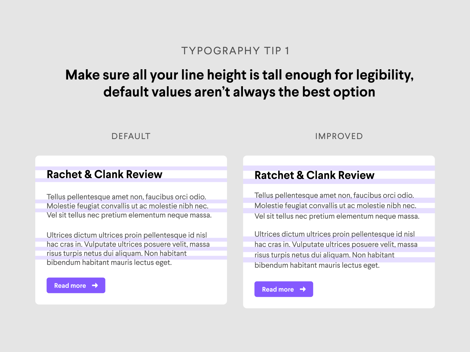
Of course it depends on your use case and the medium you are designing for, but I recommend adding a bit more space for line height to allow better scan-ability for users. Keep in mind that there is a sweet spot for typography line height though, push it too far and you'll risk the same issues in the opposite direction.
If you are unsure how to choose values for type sizes and line height, this is also covered in my video How to Choose Text Styles and Sizes in Design for Design Systems, Apps, and Websites.
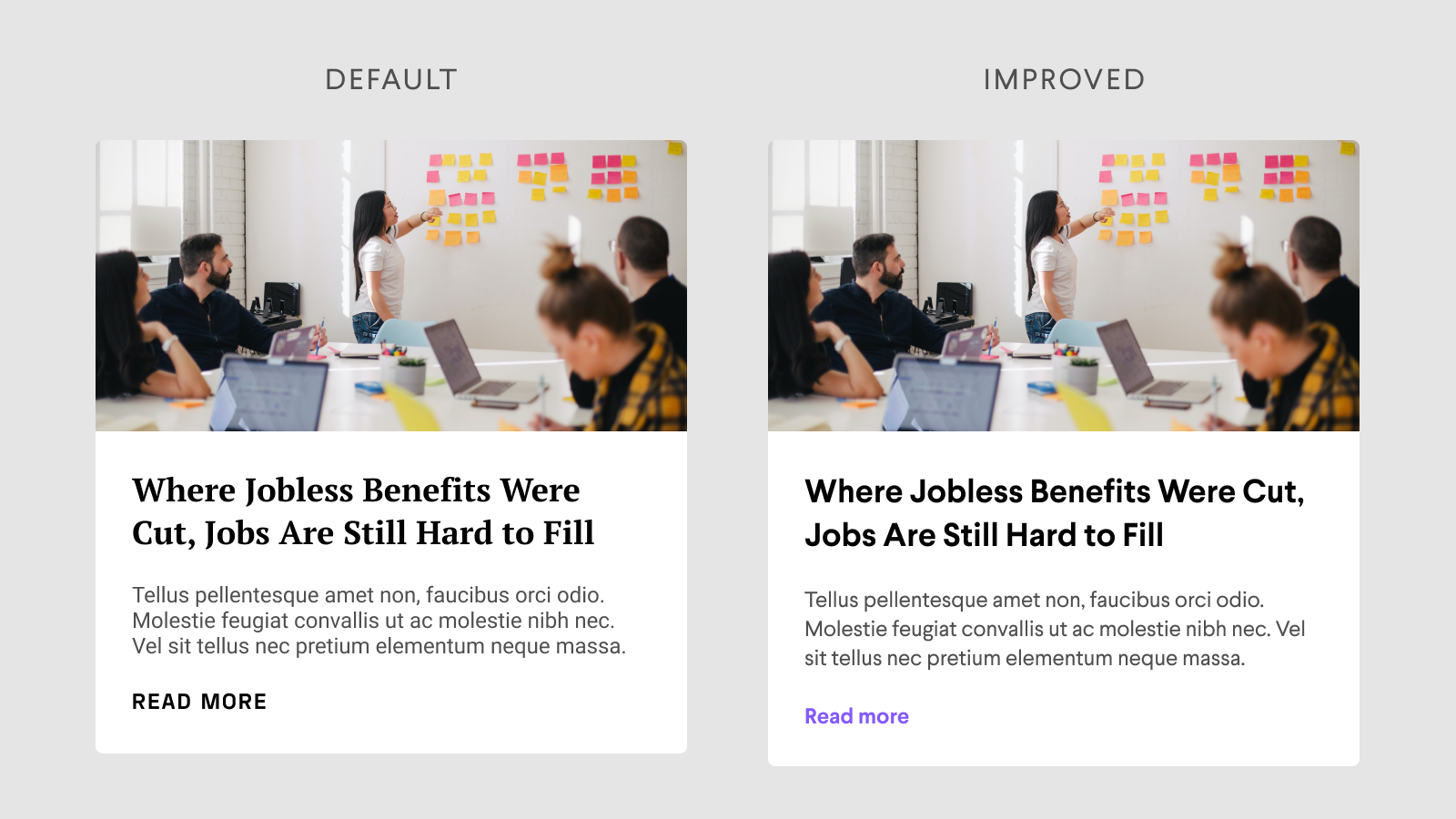
Tip 3: Create clear hierarchy in your designs using type sizes, weights, and color
The third of my practical typography tips is arguably the hardest one to get right given the variables, but you should always try to create clear hierarchy in your designs using type sizes, weights, and color. Rather than using the same size, color, and font weight in your designs, it's better to create hierarchy by varying the values of these accordingly to your design goals and format. Check out the example below.

Immediately you can tell the difference in communication strength between the left and right, and there are only 2 elements that are changed between them. Now imagine you scale this across a whole design system, product, or website—you can imagine the impact this can make when done correctly.
Like most design tips, this one is a bit dependent on your design's goals, user experience, target market, and more. It's important to keep these in mind when you're making design decisions like this, and making sure you are implementing them globally when/if possible for consistency.
If you're looking to learn how to choose consistent colors in typography, check out my blog article on How to Use and Choose Text Colors in Product Design.
Tip 4: Use 2 typefaces max and assign each to their own use cases
The fourth of my practical typography tips is designs should not use more than 2 typefaces. There are of course edge cases (for shock value, to highlight certain elements, etc), but I tend to stay away from using more than 2 typefaces as often as I can.
For one, this helps to reduce the cognitive load for both you as a designer and for your users. You won't have to spend time deciding which of these typefaces you have to choose for what case, and users' minds will have a much easier time processing your design work.
Secondly, the more typefaces you use, the more time your app or website takes to load and render elements on the page. Typefaces are "called" from another website or back-end when used in apps and websites, therefore increasing time for your page to load fully. The less typefaces you use, the less time the browser or device needs to take to load.
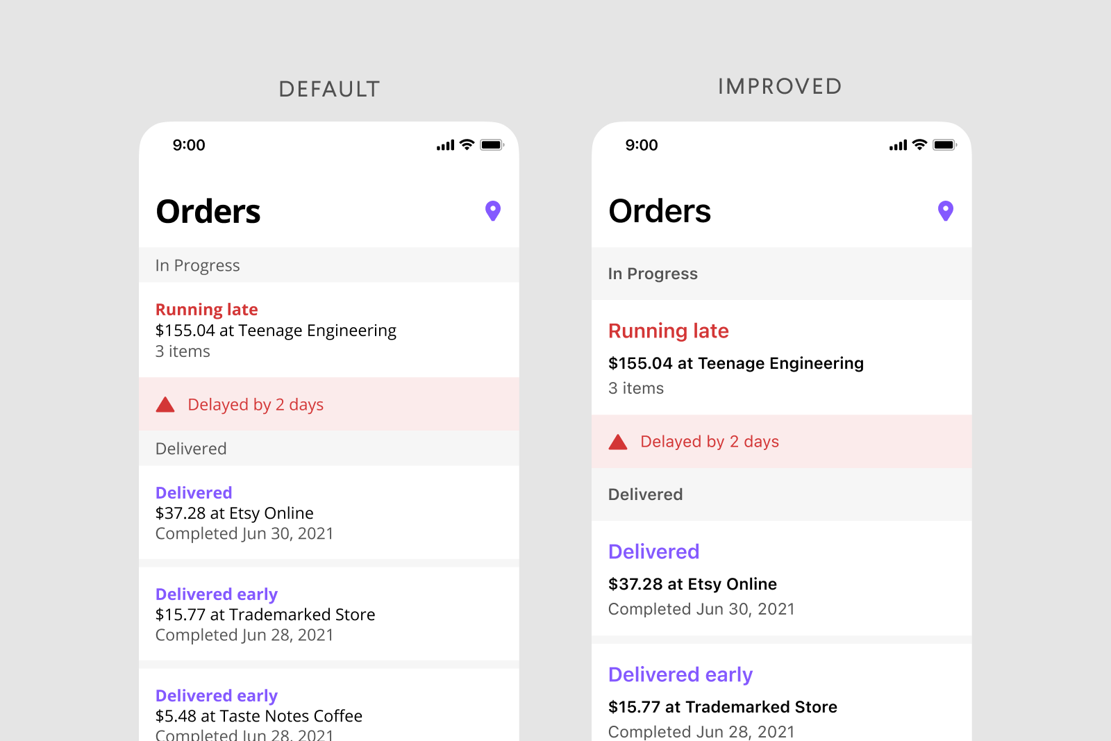
Tip 5: Use 3 font weights max and assign them to sizes or use cases
The fifth of my practical typography tips is to only use 3 font weight variations in your work at most. To be honest, I typically prefer only 2 here but have run into valid situations where this may be different (uppercase labels, bold actions, etc).
Again, this helps to reduce the cognitive load for both you as a designer and for your users. Pushing this limit will also have a negative impact on third tip as you create hierarchy using these weights, sizes, and colors. Check out the example below to visualize this tip as well as my fourth tip on typography treatment.
Tip 6: Use system fonts when possible for better load times and accessibility
The sicth of my practical typography tips is to use system fonts when possible. System fonts are the typefaces created specifically for each operating system by that relative company. Apple's typeface is San Francisco, Google's typeface is Roboto, and Microsoft's typeface is Segoe.
Each of these typefaces were created in-house by these companies in order to have typefaces that fit with their products seamlessly. Each of these has accessibility treatments specific to the operating system they are tied to. Using them in your designs and products will automatically give you access to accessibility factors that are already thought through and implemented, leading to a better user experience. See the image in my seventh tip for reference.
On top of accessibility, this also improves load times. Similar to my fourth tip, system fonts are already loaded onto the devices that people use. Because of this, typefaces don't need to be loaded as a separate element because they already exist on the device your user is on.
There is always the matter of brand that comes into play when choosing typefaces for your products as well. It depends on your specific product and situation, but even then I tend to rely on system fonts personally. For example, Mothership's branding does not use system fonts but when designing products we opted for system fonts for the reasons I listed above.
Tip 7: Give type space to breathe
The seventh of my practical typography tips is to give your type space to breath. Similar to my second tip, but this focuses on spacing between separate type elements in your designs. Try to be conscious of how much space you are allowing between text elements, finding a balance between grouping and communication. Check out the example below.
While the left option is still legible and usable, the right option communicates much quicker just by improving spacing and being conscious of how text elements are grouped. As an added bonus, I also added better hierarchy and used system fonts to really bring home the previous tips you read.
Tip 8: Learning about typography through resources
The eighth and final of my practical typography tips is to learn about typography through resources. Typography is surprisingly complex as you start to dive deeper in how to use and create typefaces. Taking the time to research and read up on approaches to typography can change your perspective on typography and how it can impact your design work. Lucky for you, I've compiled some of my favorite typography resources for you:
- The Elements of Typographic Style
- How to Use and Choose Text Colors in Product Design
- Thinking with Type
- Practical Typography Tips to Improve (Video)
- Grid Systems in Design
- Webfonts on the Prarie
- Typography in Design Systems


No Comments.