
If you're unfamiliar, the Playdate is a unique, little yellow handheld video game console with a gorgeous black and white screen and a crank. It was designed by the hardware geniuses at Teenage Engineering (creators of the OP-1, KO-33, and other instruments) in collaboration with the wonderful folks at Panic (makers of Transmit and Nova who also publish video games).
The Playdate is my favorite handheld console when I'm away from home because of how easy it is to wake and play for the few minutes I have while waiting at a coffee shop or running errands. While I do enjoy bringing a GameBoy or an emulator device usually, most of those are on the larger side and don't have a sleep mode. On the other hand, the Playdate is both tiny and has a sleep mode!
I'm a huge fan of longer and more involved games for extended play sessions. But when I just have a handful of minutes to play, it's difficult to jump in and out of games where I need to remember context or what I was doing last I played. So, I've been trying out a bunch of shorter games you can easily play for just a few minutes each play session on the Playdate. The Playdate has a plethora of exclusive games on their curated Playdate Catalog (think Apple App Store), but you can also just buy or find games online at places like Itch.io.
I'm Making a Playdate Video Game
Oh! And as a PSA, I'm currently working on my first ever video game after being a player of games for my entire life. It's going to be an adventure survival horror game, and it's going to be exclusive to the Playdate! But no worries if you don't have a Playdate console, you'll be able to play it on a computer using an emulator if that's something you'd like to do. Watch this blog or follow me on Threads & Instagram to stay updated.
Here are the best pick up and play Playdate games I've found so far:
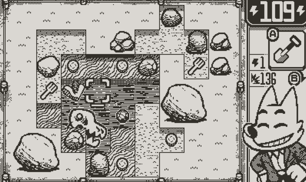
Dig Dig Dino
Made by Dom2D & Fáyer, Dig Dig Dino! is a game about digging... for dinosaurs bones and other treasure. Each dig session is just a couple minutes and surprisingly cathartic! It has some very light rogue elements such as permanent unlocks to make equipment better which makes your dig sessions easier. The goal is to find enough bones to open up new dig sites (up to 3), and figure out the mystery of an alternate historical telling of what happened to the dinosaurs.
Link to Dig Dig Dino! on the Playdate Catalog →
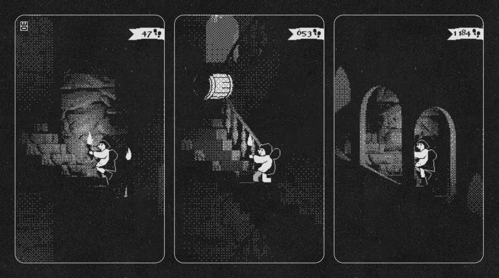
A Fool's Errand
Made by IORAMA, A Fool's Errand is quite a unique experience on Playdate. Not only is the style of the game incredible, It's one of the very few games I know of that use the Playdate console screen in a 90-degree rotated orientation! It's also a game controlled fully by the crank, which is always a fun twist. Runs don't last super long (unless you get really good then it's seemingly endless), and it's super quick to start a new run with basically 0 other interfaces than the game.
Link to A Fool's Errand on the Playdate Catalog →
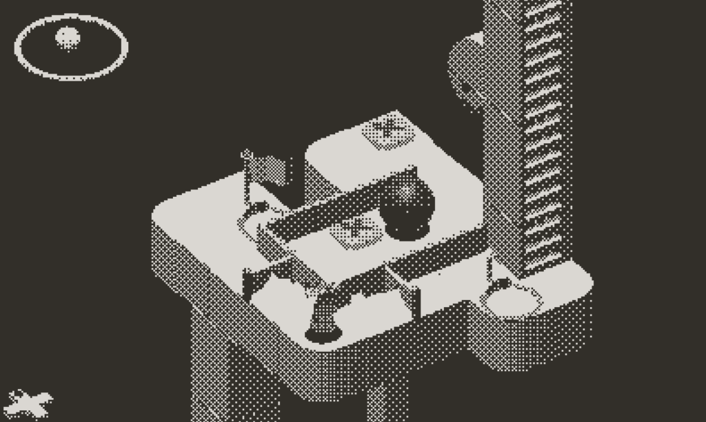
Diora
Described as "Playdate's Monument Valley", Diora has been one of the most anticipated Playdate Console games that I've seen since Lucas Pope's Mars After Midnight. Diora is a 3D puzzle game which blends the use of D-pad movement to move your character, and the Playdate crank to rotate your view of the environment around a central axis.
While some of the levels can take longer if you get stumped, the challenges are quite self-contained with their own checkpoints, so you can take another try at the puzzle in just a few minutes. While there is a narrative (at least where I currently am in the game), it's very light and doesn't take much time to get through.
Link to Diora on Playdate Catalog →
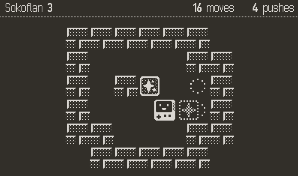
Soko
Soko is a small Sokoban style game for the Playdate, with over 400 puzzles and 7 sets of levels. The game is ridiculously cute and easy to learn. I enjoy it for short game sessions because you are able to work on the puzzles at your own pace given there are no reaction times or high scores to set (unless you want to of course). This is a Playdate game you can even play with something else on in the background, which is great for fellow ADD folks!
Link to Soko on Playdate Catalog →
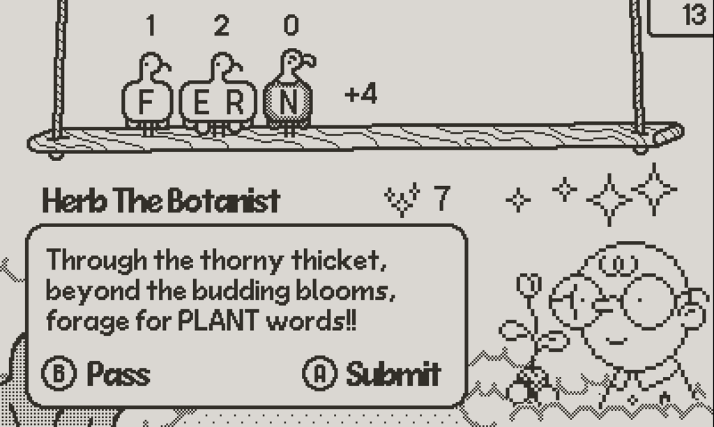
BWIRDS
BWIRDS is a fun, unique take on word games where you are limited to the "bwirds" available to you as the letter pool you can use. You also need to bring the requester a word within a specific theme such as plants, food, etc. The constraints of this word game I think are what make it enjoyable, with just enough thinking without being frustrating! I really enjoy it for short game sessions, reminds me of when I used to play Words with Friends a while back.
Link to BWIRDS on Playdate Catalog →
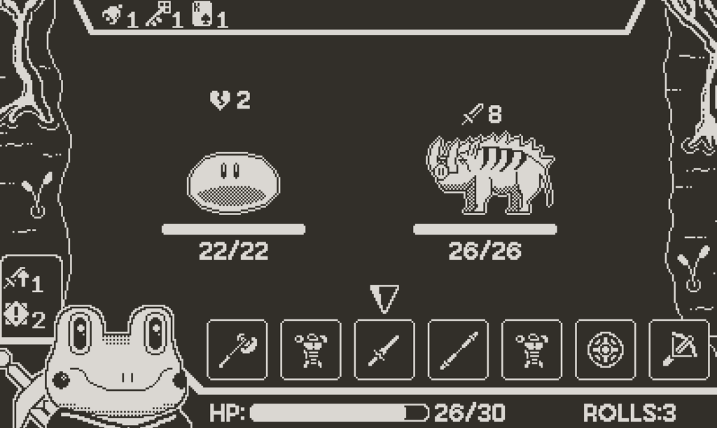
Ribbit Rogue
As a sucker for rogue style games (basically unlocking more the more you play), I was yearning for something like that on the Playdate. Ribbit Rogue fits this pretty darn well, with a quirky thematic spin on your fantasy rogue style game. The rounds are just a couple minutes typically, and have a really fun crank mechanic built in to the dice rolling part of the game! My only small gripe with the game is there does not seem to be any permanent unlocks (I could be wrong as I have only played a few hours).
Link to Ribbit Rogue on Playdate Catalog →
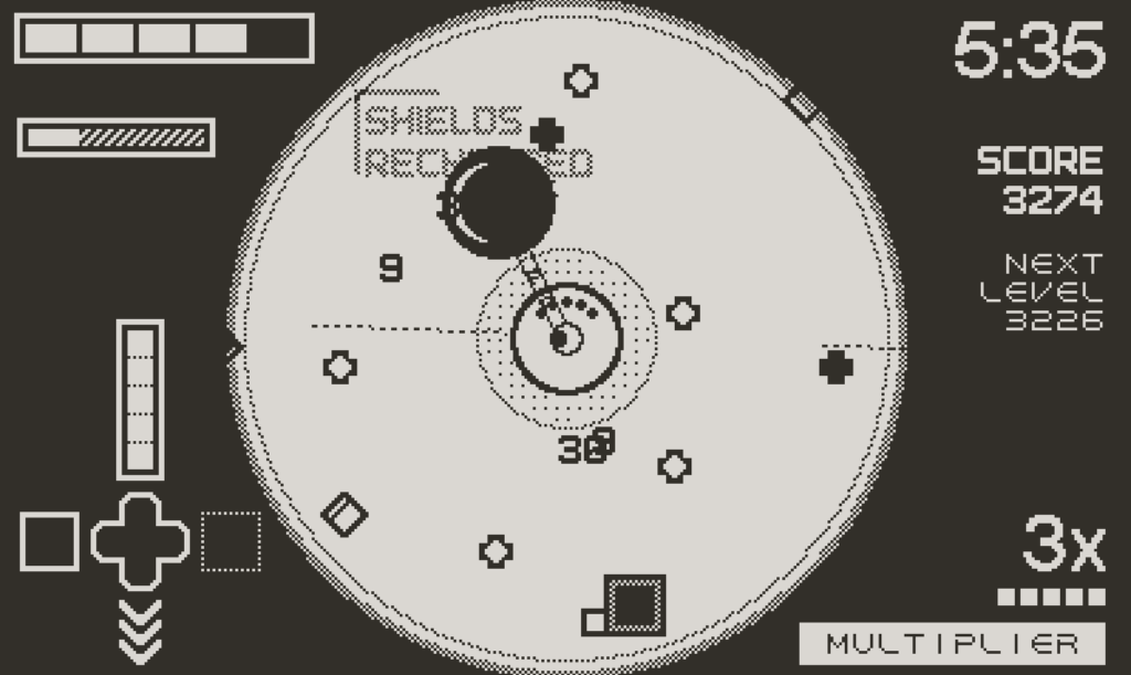
Fulcrum Defender
Fulcrum Defender is an arcade action game exclusive to the Playdate Catalog from the creators of FTL: Faster Than Light and Into the Breach. You control the game with the D-pad and the crank to fend of waves of shapes (enemies) and create an optimal build that works for your play style. Since I haven't gotten very far, runs last just a few minutes, but I've heard they can be longer if you get better. So maybe just don't get too good at it!
Link to Fulcrum Defender on Playdate Catalog →
Pick Pack Pup
Pick Pack Pup for the Playdate is one of the games that comes included on the device (in Season 1). Pick Pack Pup is similar to your classic "match 3" style games, except you are trying to match similar items to pack up for the factory your player works for. Something that sets this apart from the typical style of these games is the fact that you can move the items wherever you want (as long as there isn't a box in the way), in contrast to only moving 1 block to an adjacent tile you're usually limited to.
Link to Pick Pack Pup on Playdate Catalog →
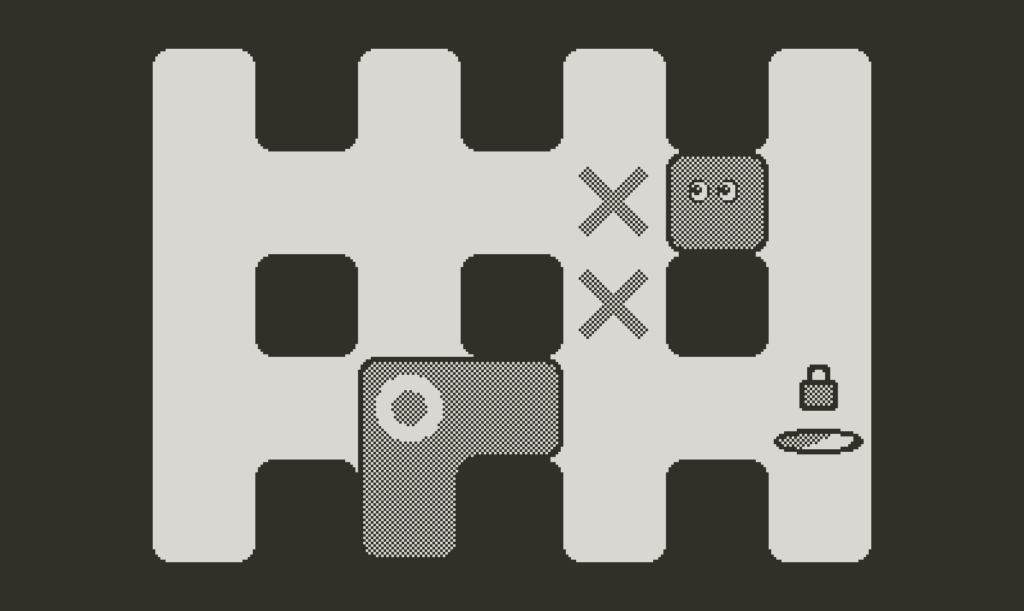
Skwish
Skwish is an interesting puzzle game on the Playdate console. It combines both pushing and merging blocks in ways to get from one side of the puzzle to the other. This game provides just enough thinking to be fun without getting too frustrating, very easy to pick up and play as needed!
Link to Skwish on Playdate Catalog →
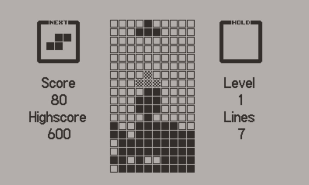
Blockdate
It's Tetris, but on the Playdate. Not much else to say about it!
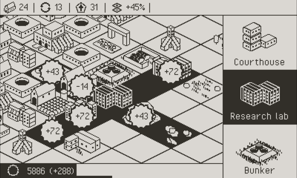
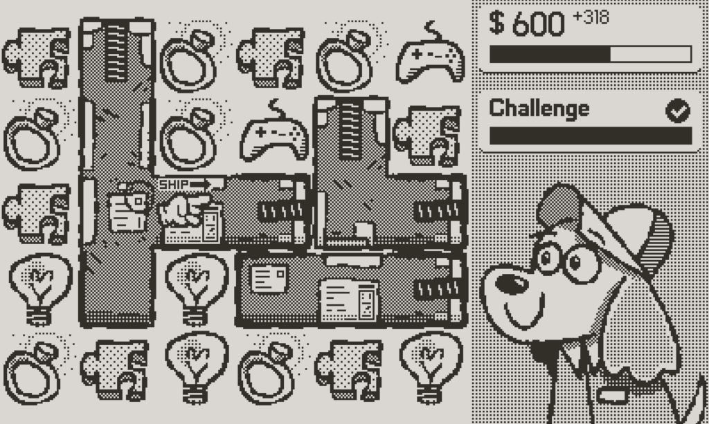
Mega Dystopia Micro Architect
Mega Dystopia Micro Architect (or MDMA lol) is a tiny city builder with a daily mode that is infinitely replayable. You're trying to build the most efficient city, and doing so in many different "runs". You unlock permanent upgrades the more you play, which makes it easier to continuously get higher and higher scores!
Link to Mega Dystopia Micro Architect on Playdate Catalog →
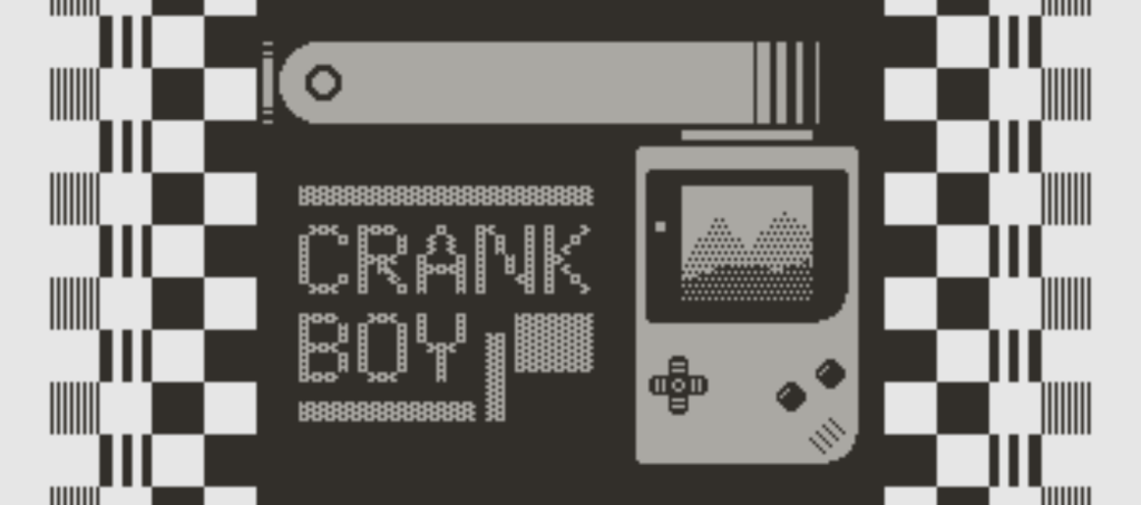
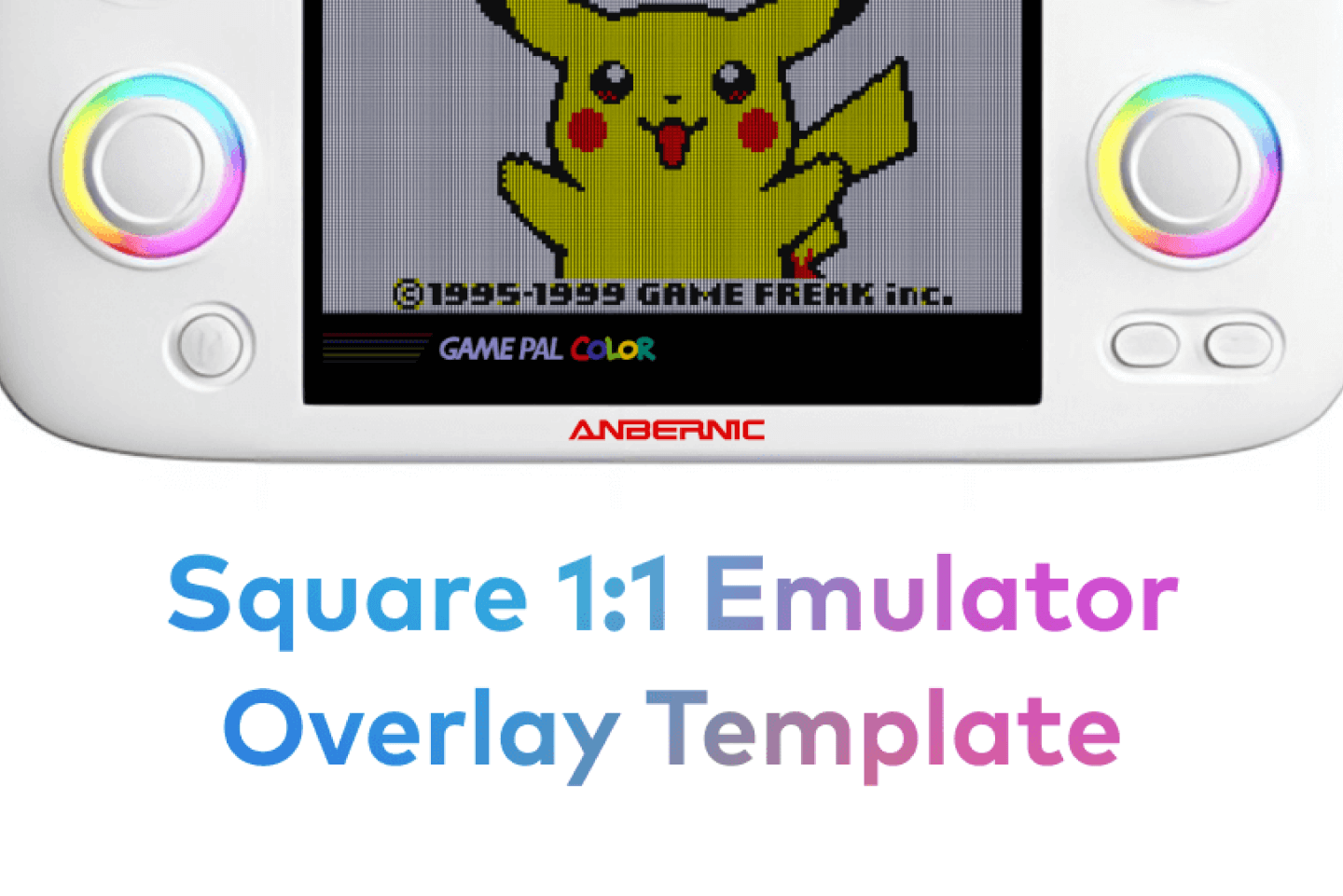
Honorable Mention: CrankBoy
This is an honorable mention because CrankBoy isn't technically a game. However, based on the name you might be able to guess that this is an emulator for GameBoy on the Playdate. I'm not sure what emulation code magic is being done here, but you can run just about any GameBoy or GameBoy Color game on the Playdate. This opens up a world of other games you may (or may not) have grown up with such as the Pokémon games, Dragon Quest, Zelda, and many more!


