March 11, 2022No Comments

How Taking Care of Yourself Takes Care of Your Team

Join my newsletter →

After hiring our 3rd designer at Northstar, I’ve been shifting a lot of my growth to learning about being a leader and mentor for my team. It’s a huge challenge for me personally, who has been mainly an IC designer in every role I’ve had in some capacity.

Now that things are starting to shift and my day-to-day is more around decision making and process iterations, people look to me for answers and guidance each day. I don’t know about you, but it’s scary to have that pressure every day you show up to work.

I know it comes with the territory and I asked for this in a way, but some days get harder to work through.“If I just put in a few more hours, our goals will be achieved more quickly.”

“My team is counting on me, this has to be done tonight.”

“Eh, I can skip lunch for this call. I’ll eat after!”

“I can’t sleep in, what if an emergency happens even though it’s 7:00am on a Thursday?”

But after one-too-many weeks of this, I’d be setting myself and my team up for a worse situation.

When I don’t take care of myself mentally or physically, I slowly expend my energy exponentially. I’m not as alert in meetings, I’m distracted by stress, I’m overly irritable, I’m not myself.

I want to be the best version of myself for those around me. That way, I’ll be better able to do what I do best. I listen better, I’m able to focus easier, I’m more open to receiving feedback, and I give better feedback myself.

What You Can Do

You need to put yourself first. Not in a malicious way, but in a way that sets healthy boundaries between work and life. Boundaries that put your health and comfort first, in a way that lets you do your best work. It’s one thing to be self-disciplined and motivated, but another to drive your life into the ground for it.

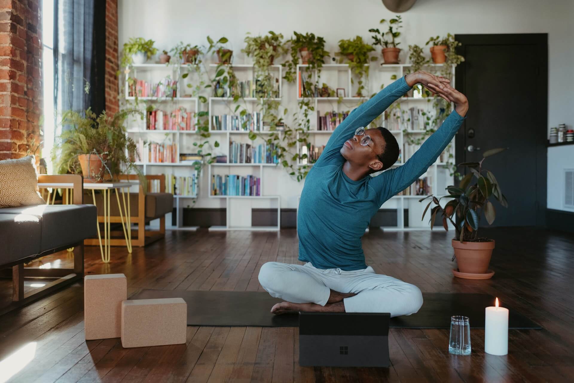
Remember to spend time with yourself and with your family/friends. Do things that bring you joy and pursue your hobbies. Remember to exercise, eat right, and take care of your body. Go to therapy and work on yourself. Maybe try meditation or yoga before work. Remember to do nothing sometimes too, just exist and listen to the world around you.

Put yourself before anything, the people around you will be happy you did.

August 24, 20211 Comment

One Month as Head of Design at Northstar

Recap of my first month at my new design job as Head of Design, working on product design, design systems, leadership, marketing, and more

Read more

August 1, 2021No Comments

What to Do Your First Week of a New Design Job

So it's your first week in a new design role, what do you do? What should you have prepared? Here are 10 ways to set yourself up for success.

Read more

May 12, 20211 Comment

How to Use and Choose Text Colors in Product Design

One of my biggest struggles starting out in Product Design was the ability to make consistent color palettes. Creating typography and color palettes that worked within product constraints without sacrificing recognizability on countless screens. I needed a reliable way to experiment with composition without ditching pre-existing styles and screens. Using different shades of grays, sacrificing accessibility, and not knowing when or how to use colors without a strict system in place was frustrating and limiting.

After a long time of experiencing this frustration, once I started learning to code a few years ago things clicked for me. I could use opacity! With opacity, I could blend layers of elements together and still maintain a harmonious color palette, build more accessible products, experiment with layout more, and take another problem off my plate to think through.

Using in Product Design Practice

Using different shades of grays with determined hex codes can lead to poor contrasts between elements and leave interfaces inconsistent, inaccessible for some users, and even just plain ugly sometimes. Instead, I found using a pure white and a pure black (or with a tiny amount of hue if you’d like!) as a starting point and taking advantage of opacity to be a much better tactic. This makes it much easier to develop color palettes, design systems, product iterations, and work better (and quicker!) towards product goals.

Not making sense yet? No worries! Here’s a visual:

As you can see, the usual approach on the left makes it quite difficult to consistently create text that is legible without using a pure white or black on top of the color or having a very specific and well-maintained system in place. Both of these solutions are tedious and hard to implement across teams and passing off to developers.

Setting Typography Rules for Color in Product Design

The white and black opacity approaches on the right are consistently legible and don’t require verbose rules and guides to follow. Although the ones above are random, I usually stick to 20%, 40%, 60%, 80%, and 100%, giving each their specific use case. This dwindles the amount of rules to remember down quite a bit and still provides enough flexibility to build a system around them while promoting experimentation in screen layouts and UX decisions.

Of course, there are still limitations here. Some of the examples above could do with a higher or lower opacity to make them 100% AAA compliant. For example, you wouldn’t want to put 20% white text on top of a yellow color or a 80% black text on top of a dark purple. It’s important to keep those in mind as well, but this post is more to provide a basis for building a better system, not so much a cheat sheet and an answer to everything.

If you want a real-life example, my personal website (https://www.cortes.us) is built entirely with different opacities of white and black for text mixed with colors throughout.

What About Passing to Developers?

Okay so now you may be asking yourself how you can communicate this system with a developer and how it would work in code. It’s actually quite simple! Luckily for you, both mobile (yes, native too) and web technologies support an RGBA function as a way to specify color values. How does this work? Here’s a little key and example:

rgba(230,18,75,0.5);

// the first 3 numbers are your R, G, and B values (0 - 256).
// the last digit is the alpha, or opacity in our case
  // pass in a decimal number equal to the opacity you want 


// EXAMPLES

// For a black at 5% opacity
color: rgba(0,0,0,0.05);

// For a white at 80% opacity
color: rgba(256,256,256,0.8);

And voilà! You can create a key very simply for developers like you normally would with a style sheet of some sort, just exchange hex codes for RGBA function values for your neutral colors. I’d also recommend creating a guide around when and where to use certain opacities (40% black with uppercase text at .875rem for secondary titles for example).

June 19, 2020No Comments

Apps That Make MacOS a Better Operating System to Use

Even as an Apple fanboy that loves MacOS and iOS, I know that like any software, it isn’t perfect. Not to mention the lack of customization options and (at times) a cluttered interface.

Over time, I’ve found a few apps that replace default Mac apps that make MacOS a better operating system to use. I happily pay and advertise how useful they are just because of the sheer influence and impact they’ve had on my digital workspace and workflow.

In this article I’ll happily share them with you and (hopefully) dodge the dozens of questions I get every time I post a screenshot of something and happen to include one of those apps. Kidding! But no seriously, I need a place to direct people that ask this over and over ?

Bartender

https://www.macbartender.com - $15

Example of how the Bartender interface works

I’m the type of person that likes to have the least amount of visual clutter and items in my view when I’m working. I tend to get easily distracted by icons and notifications and have geared my digital workspace to avoid that.

Bartender has been one of the best apps for this quirk that I have as it takes those 10–20 icons that show in your top bar and hides them in a secondary bar you can toggle on/off easily. No more having to get distracted by random red notifications and status updates!

Alfred

https://www.alfredapp.com - free or $19 for full

Alfred spotlight search interface

To be honest, I’m still baffled that Apple’s Spotlight feature is as poorly made as it is. It has become quite unpredictable, doesn’t accept keywords to better filter what a user wants, searches unusable files, mixes files with apps in search, etc.

This is where Alfred comes in. Alfred is basically a customizable version of what Spotlight should be. Not only can you customize the look of Alfred, you can also add and create “workflows” to make your own shortcuts that make your life easier. Alfred also uses certain keywords to better understand what you’re looking for and what actions you are trying to take. For example, if you just type a name it will search for apps, but if you type “open” then the file name, Alfred will switch from looking at your apps to looking at files you can open.

uBar

https://brawersoftware.com/products/ubar - $30

uBar dock interface

I get asked about this app the most and I can understand why if I’m being honest. While MacOS default dock gets the job done, it doesn’t try and do much more outside of that (possibly for better battery management). uBar takes your dock up a notch while also making it quite nicer to use, while customizable and nicer to look at.

uBar creates a smaller dock that can hold favorite apps you have, provide better context on notifications, generates window previews on hover, lets you choose which window to open to, lets you see a calendar on hover, and gives shortcut access to your main Finder folders and preferences just to name a few. I personally like that it feels more out of the way than the original dock and still feels in place in adjacency to the top bar. You can even change where it is positioned and the style of dock you’d like.

CloudApp

https://www.getcloudapp.com - free or $8 for Pro

Process of a screen recording in CloudApp

Just like Alfred, CloudApp makes the original MacOS screenshots ten times better. With CloudApp you can use a keyboard shortcut to take a screenshot (or record a gif!) and instantly get a link that you can share with others.

This app has been super helpful for me in my work life for sharing screenshots of design and code items I’m working on for instant feedback and no hassle of uploading. CloudApp is super fast and makes recording gifs when showing animations or click throughs very easy as well.

VEEER

https://veeer.io - free

Overview of the VEEER user manual

While there are quite a few window managers out there for Mac, I personally use VEEER because of how lightweight it is. It does what I need it to without using up RAM and slowing down what I’m working on. It also has a few small unique shortcuts like the way it alternates full screen and minimized windows.


Hope you found this valuable and I hope you try out the apps I mentioned. Got other apps that make MacOS better? Let me know which others I need to try out!

June 8, 2018No Comments

Ways to Use an iPad for Product Design Work

Apple’s iPad is advertised as a stand alone device that can replace a laptop, but for many this definitely isn’t the case yet. For example, as a Product Designer, I can’t open Sketch or Abstract and go to town on my design files. Or as a developer I can’t reliably code and run a local server to work on a project.

As someone who bought a 12.9" iPad Pro a couple years back, I was hoping this would change. While I can’t do exactly what I mentioned above in the way I would like to, I’ve been able to find ways to bring the iPad more and more into my workflow for design work.

Research and Notes

A spot where the iPad can really shine is in the research phase of work. Research typically only requires a web browser and a way to document your findings which makes the iPad’s split screen perfect for the job.

Image courtesy of Apple.com

My setup consists of a Chrome browser open on the left of my screen and default Apple Notes on the right. You can of course switch these out for whichever replacements you’d like (Google Docs, Dropbox Paper, etc). The side-by-side apps lets me enlarge and shrink windows as I need and even lets me drag and drop both text and media from my browser on to my Notes. This lets me seamlessly mix documentation with my own thoughts and findings. Throw my Apple Pencil into the mix for drawing extras on notes and I’m set for getting my notes complete and organized.

I’ve used this method on countless projects as I really enjoy the mobile aspect of an iPad versus a laptop. Working on the couch or outside or at a coffee shop with a smaller form factor is great. Not to mention mixing touch with writing and drawing (Apple Pencil) is a delight that I think is tough to find in products.

Wireframing

By far my favorite part of design work on an iPad. While there are definitely different ways you can do this depending on your style, I’ll give some recommendations based on my preference.

Photo courtesy of Pattern

Pattern is a favorite app of mine for wireframing. Despite some limitations (no zooming, some tedious editing aspects), Pattern is great for basic wireframing of design screens. The app provides a minimal but useful interface with some delightful interactions for creating interfaces. I personally enjoy the Apple Pencil capabilities as well for making notes directly on your wireframes.

Procreate, while considered more of an app for art, is great for wireframing as well. It’s definitely more difficult to create refined shapes and lines like you can in Pattern, but the layering and editing capabilities can make up for this depending on what you’re looking for.

Inspiration

While producing work is important, consuming of inspiration and other subjects is an paramount in your creative process as well. Luckily, there are a plethora of ways to do this with an iPad. Using a browser the same way you would on a computer to browse you bookmarks and favorite websites is a sure way to do this.

In terms of apps to use, Pinterest is an obvious one for most folks and happens to be a favorite of mine as well. While following people on Pinterest has become pretty obsolete nowadays due to their home feed changes, Pinterest does a great job of feeding relevant posts related to pins you have saved before.


While there are other apps to use such as the Adobe suite, the apps and methods I listed above are the way I personally use my iPad within my product design workflow on an almost daily basis outside of hifi work. Hopefully we’ll see this change in the future and be able to do full-fledged design work but for now this is the method I use.

May 25, 2018No Comments

How to Be Well Prepared for Morning Standups

Since joining MetaLab a few months ago, I’ve had to transition back into daily stand-ups after not having them since I worked at Satchel last year. While stand-ups are incredibly useful in a work setting, it definitely takes some preparation and getting used to or can lead to miscommunication or even be action-less at the end.

Here are some tips I’ve implemented for myself that you may find useful for your own standup preparation:

Write down tasks you complete throughout the day

At first I thought I could remember off the top of my head everything that I did the day before but I was completely wrong. Some days I would forget a few tasks that were completed and would jeopardize deadlines or personal task lists.

Instead, I now keep a notebook next to me throughout the day at my desk and I write down each tasks I finish that day no matter how big or how small the task is. Then the next day I have an accurate list ready to go and talk through with my team.

Write down specific blockers you had during the day

Sometimes I’ll have some software issues during the day (cough InVision cough) that can put an hour or so dent into my workday. Or sometimes I’ll be waiting for another task to be completed by another team member before I can proceed. Addressing these blockers in stand-ups is crucial to be transparent with your team and your team may have advice on how to better approach these blockers next time you face them.

Leave stand-ups with clear action items

Ever leave a stand-up and need to think for a second about what actually needs to get done? No, just me? All joking aside, this is an obvious but important one. Make sure you have a clear picture of the goals for your tasks that day and what needs to get done for that day. It helps!

Ask for prioritization of tasks for that day

A genuine mistake I used to make was not asking for prioritization of tasks. Some tasks needed to be done before others for client presentations or calls so it was important to put those first.

Not asking for priority level on tasks can lead to interference with the schedule and tasks of others which you definitely don’t want to be the cause of. Prioritizing your tasks for the day also allows for some leeway if not every task gets done because you got the most important ones out of the way at least.

May 11, 20181 Comment

Making Your Phone a Tool, Not a Distraction

While I was first transitioning back into working from home a few months ago, a bad habit I realized I had was checking my phone constantly during breaks. I use a Pomodoro technique where I work for 20 minutes and then take a 2–3 minute break and every break I had I would reach for my phone.

It is a break after all though, so what’s the harm in checking my phone? Well for me personally it didn’t feel like a break. It distracted me; left me thinking about posts I saw on Instagram or how many notifications are waiting for me on Twitter. A break should be a reset from work, not an additional element on the mind. A few weeks ago I got fed up with checking my phone for no reason and decided to do something about it.

A phone should be a tool, that’s what made it such an innovation when smartphones with touchscreens came into our lives. How could I reset the way I use my phone and gear it more towards a tool? Here’s how I approached it:

  1. Only have necessary apps on the main home screen of my phone that I use daily.
  2. Turn of all notifications except phone calls, texts, and Slack messages (only during work hours).
  3. Delete social media apps that have a desktop alternative so I only use them on a computer (Twitter, Facebook, Pinterest, etc.).
  4. Hide apps in folders that didn’t have alternatives but I still needed at times (Instagram [mainly to post], Uber Eats, Strava, etc.). This provides friction in comparison of just one tap on the home screen
  5. Make my phone feel plain (black backgrounds, only a few apps in plain sight, no red notification icons).

After all this, this is what my home screen ends up looking like. I use each of these apps every single day and none of them have immediate distractions to them. Even a black background (I made a thin color gradient around it to make it a little nicer) to have what I need from and center and no questions as to what I need and where it is.

This setup is more of a tool for me in which I am able to easier accomplish things in both work and personal life as well as passive tracking and even photography. I keep random apps you need to have and apps I mentioned above in another folder on the second screen to keep them from being in plain sight. I also keep miscellaneous apps like banking apps, Lyft, calendar, and email tucked away since I do need them but not front and center like these that I use every day.

I recommend doing the same with your phone if you relate to the feelings I had towards my phone. While social media, games, etc. have nothing inherently wrong with them, I think there is a time and place for these and probably not the best to have them sitting at arms reach 24/7.


Shortly after I went and did this with my phone I found this great post on making a “dumber phone” if you’d like more: https://nomasters.io/posts/dumber-phone

cowart-avatar-5-small

If you find the content on my website, YouTube, and elsewhere helpful and want to show extra support, you can buy me a coffee here ☕

gengar

© 2012 - 2024